If you are an Excel user, are you aware of how flexible it is? Do you really take advantage of this flexibility when making charts? You can simply enter a few values and some (almost) random cells and visualize them. You can add empty rows or use dummy variables. When it comes to formatting, you can format at the data point level, not at the series level.
This flexibility comes at a price. You only understand the difference between Excel and a visualization tool like Tableau or PowerBI when you want to do something and the tool doesn’t let you do it (and there is no workaround) or you can do it but it’s much easier to do it in Excel. And it’s also a matter of skills.
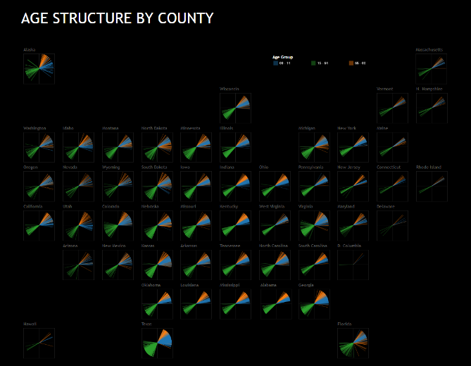
To test the three tools, I tried to create a fan chart, that is, a non-stacked pie chart where all slices start at the vertical position. Because they are not stacked, you can add as many slices as you want. In this case, for each pie we have three slices (corresponding to age groups) multiplied by the number of counties in a state. This will let you identify the overall distribution by age group and the range of values in each group.
Excel
Take the image above. Once you have the right data, each chart is very easy to make. Each chart is a scatterplot with four series. The charts tend to change size when we zoom in and out, and it’s hard to align them. The best solution is a loop in VBA to correctly size and position each chart. Obviously, being an image, there is no interaction.
(Click the image to expand. if it gets too large for your screen, scroll down and click anywhere outside the image.)
Tableau
(Click the dashboard to play in Tableau Public. I don’t understand why you can’t play with it here, sorry.)
The image above is the same dashboard, now made in Tableau. Tableau is great, and I really should learn more about it. I was unable to add a series to draw a circle, and that annoyed me. Also, I’d like to change properties of multiple objects in a dashboard. The nice thing when playing with Tableau is that I always have fun making mistakes:


PowerBI
I had virtually no experience with PowerBI and playing with its ETL capabilities was almost fun (let’s assume that ETL fun is an oxymoron, OK?). So, I want to like PowerBI, I really do. Problem is, when it comes to actual visualization, things are not so bright. As you can see, I couldn’t create a connected scatterplot, so I decided I was not going to create the entire dashboard. Changing dot size, transparencies and many other little things were also unavailable.
I know defaults in PowerBI are far better than in Excel, and that can be a good starting point for many users. If I had to choose, I’d rather prefer ugly defaults, as long as I could change them.
There is much to be done if Microsoft wants us to forgive all its (past & present) data visualization sins. I actually don’t understand what it wants to do with PowerBI. Visualization-wise, PowerBI looks, from the point of view of an advanced Excel user, like a minimum viable product with basic format and design options. I don’t know if Microsoft wants to fill the gaps or wants the users to fill them, via custom visuals. By the way, this is a good idea, but not for the average user. I don’t think I can use PowerBI as it stands, but I’ll keep an eye on it and on the constant updates.
If you have any suggestions regarding any of these charts let me know in the comments below.
PS: To lay out the states I used Jon’s structure in this excellent post.
_________
If you liked this post (and the blog, in general), please consider buying my book. Everything I write here will make much more sense after you read it:). Thanks!)