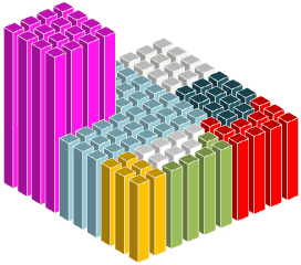
OK, maybe “love” is too strong a word. Let’s say that 3D column/bar charts are like a tall and ugly building: better appreciated from the top, where you can’t see it but you can enjoy a great view. Like this:
Now, change the viewing angle, remove gaps and you get this:
I’m shamelessly copying the first image in Robert Kosara’s Square Pie Charts (I don’t know how Robert made his). Check his post. He makes some square pie charts like this:
I’m still using the 3D column charts, with a 3D rotation of 0º (Y), 90º (Y) and 0º (perspective). We can have some fun and use circles instead of squares:
Or fill the columns with pictures:
Or we can make a panel to display alerts:
No, I really can’t fall in love with 3D column charts, but seen from above they don’t look that bad, do they? And now you know how to make a square in Excel…
[fusion_builder_container hundred_percent=”yes” overflow=”visible”][fusion_builder_row][fusion_builder_column type=”1_1″ background_position=”left top” background_color=”” border_size=”” border_color=”” border_style=”solid” spacing=”yes” background_image=”” background_repeat=”no-repeat” padding=”” margin_top=”0px” margin_bottom=”0px” class=”” id=”” animation_type=”” animation_speed=”0.3″ animation_direction=”left” hide_on_mobile=”no” center_content=”no” min_height=”none”][Upadate: Forgot to mention that Juice Analytics discusses other ways to make square pie charts here and has a screencast here.]
[/fusion_builder_column][/fusion_builder_row][/fusion_builder_container]


The problem with the square pie charts (a/k/a waffle charts) is that often you are reduced to counting the little squares to determine the values. Easier than getting out the protractor to measure angles on a round pie, maybe. But somehow I think the regular-shaped wedges are easier to judge than irregularly shaped agglomerations of little squares.
They do look like Legos, though, so they feel fun.
Jon: You are right, and that means that infographic designers love them! I don’t really care about pie charts, square or not. I do think that this technique can be (in some cases) a better alternative to conditional formatting when displaying alerts.
The square chart forces you to count squares to determine a value. Not precognitive at all.
It’s different for alerts, which only need to show position within the grid. The different appearance of the alert draws the eyes to it. Getting the row and column headers is not as easy: perhaps conditional formatting of these headers could help indicate where there is a problem. For example, in your chart you’d like KPI4 to be very obvious.