I need to learn PowerBI, as soon as possible (per client request). So, I spent much of last week using it. I wrote about the depressing experience on Twitter. I also commented on this post, and its author, Vitali Burla, invited me to show an example of a chart that can be done in Tableau but not in PowerBI.
And I was like, oh God, this is so easy it hurts. But I kept it to myself.
I am now more or less familiar with the interface of both Tableau and PowerBI, but I still need many hours to understand what makes them powerful (the languages behind calculations and metrics). I don’t know enough about the tools, but I tend to know exactly what type of visualization I want, and why. This helps.
The official truth
According to the Microsoft marketing machine, PowerBI is much better than Tableau on the data side, and it is as good as Tableau on the visual side. The former is probably true, or will be in the near future. The latter is not, and it’s hard to imagine an alternative reality where that happens.
Let me be clear here. I don’t dismiss the data side. We need products that make connections, data preparation or statistical analysis easier and faster. Data and visuals complement each other and in most projects they share a common purpose: finding and communicating insights. Also, I’m sure in many cases PowerBI will fit the requirements perfectly.
The scenario
Here is the scenario: you need to display the distribution of a few hundred or thousand data points. You do have an aggregate view, but you’ll need to check for outliers, select data points that display an interesting behavior, etc. Perhaps it makes sense to split the distribution by the categories of a meaningful variable.
A business analyst could use this display to analyse sales territories or store performance. I don’t have business data that fits the bill, so I’m going to use population data instead. I’ll use population density in European countries at a regional level (NUTS3). A second chart splits the distribution by country. If you want to play with the data you can download the file here (xls).
The visual
This is a fairly straightforward chart. You use a scatterplot with a constant y and plot the data along the x-axis. Can’t be simpler.
There can be an issue, though. When you have many data points you risk overlap. To minimize the risk, you can use different markers, smaller markers, transparency, or add a bit of noise to the values on the y-axis, so that data points don’t overlap on the vertical scale (this is called jittering). There are other techniques to reduce overlap, like shorter scale range, increase chart width or use log scales.
Assume this is a proof-of-concept chart that would need a bit more design time.
Benchmark: the Excel version
Let’s start with an Excel version. I added a first series with a single y value, a second series where the value of y is the rank of population of each country, and a dummy series to display country codes.
The most efficient marker to display data along the x-axis is a vertical line. Why most applications don’t offer this option of marker I beyond my understanding. Anyway, in Excel, you can use an image for a marker, so import a picture of 1×10 pixels and there you go, a vertical line.
I prefer a a more flexible approach. Instead of a picture, I use error bars. Here is the result:

The Tableau version
Since Tableau doesn’t include a vertical marker, I imported a custom shape. No big deal. Next, I set opacity at 20% and used a log scale. Here is the result when all data points are plotted along a single line:

I’m pretty happy with the chart. It’s easy to see the most common range of population density values, but there are variations that only the combination of transparency and the marker’s small graphical footprint allow me to see.
What if you wanted to split the distribution by country? Simple: You just need to drag the right field and it’s done. For this second chart I increase opacity a bit, since overlap is less problematic.

The PowerBI version
Let’s see if we can get the same results with PowerBI.

I guess not. I can’t import a custom marker, the available markers are gigantic for this task, and there is no transparency. Removing fill color improves a bit, but clearly not enough. The result is a continuous black line that hides relevant detail.
Chart height is also a problem. This is the minimum before the axis title gets hidden. As you can see, the Tableau design is much more compact. This can potentially impact display on small screens. It’s also interesting to note that Tableau does a better job at defining and describing the scale.
Now, what about the chart detailing the distribution by country? Here is the best I could come up with:

This is not one chart but two: I used a hidden bar chart to display country codes.
The process is slightly unintuitive, and before you can come up with something you get this message or similar a few hundred times:

I will not try to make sense of what I feel is a conceptual mess around “details”, “categorical” vs “continuous” and “Don’t summarize”. I do need to emphasize the most basic conceptual error: assuming that the x-axis and the y-axis have a different nature. This is a wrong assumption and now you’re basically doomed.
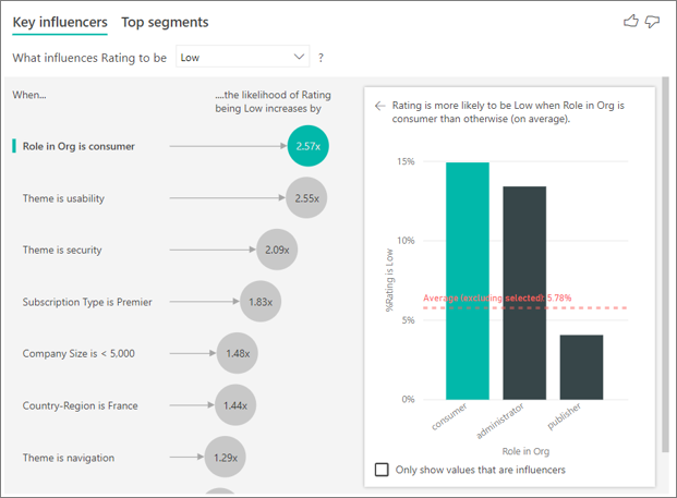
The Key Influencers visual
Some people noted that the new Key Influencers visual demonstrates how great the PowerBI visuals are. No. Actually it demonstrates the opposite. I’ll accept that the analysis behind the visual is basically magic. This makes the visual even sillier and unworthy of all that magic. It also shows that Microsoft is much better at the data side than at the visual side.
The custom visuals marketplace
Call me old-fashioned, but I believe a “self-service BI” tool should not have what feels like a half-baked chart engine. Not that PowerBI should have all the options for every imaginable chart, but the basic ideas should be right, and some consistency wouldn’t hurt, either (example: color option means transparency option, always.)
Microsoft recently decided to allow developers to monetize their custom visuals in the marketplace. That’s great, and I hope this improves the overall quality of the custom visuals. I know there are a few excellent premium visuals. If you expect to need more than a simple bar or pie chart, I advise you to factor in these extra costs.
Takeaways
If you believe the built-in visuals in PowerBI are comparable to the ones found in Tableau, choose the option that best applies to you: 1) you’re too gullible and should search for resources beyond the Microsoft marketing machine; 2) you need to increase your data visualization literacy; 3) your needs are simple and you don’t need more than this (and that’s OK!).
The whole point of this exercise is to show that the built-in visuals and the visualization process in Tableau and PowerBI are fundamentally different. Tableau demonstrates a more consistent conceptual framework and that can be seen in practice, while PowerBI visuals are messy and outdated.
That said, it’s possible that the data side in PowerBI is in fact stronger that Tableau’s. If that is true, and you need that, having someone evaluating and, if needed, developing custom visuals could be your best bet.
It’s possible that I’m terribly wrong. Help me see the truth, but please don’t start with “use the custom visuals or R”, because that’s not the point.
Not sure if you are wrong.
The word of mouth in my organization is that Tableau is stronger in Big Data and that visuals (basic) are easier in PowerBi.
anyway, we approach it by building custom visuals for PowerBi.
But the business case between both is interesting to develop, so please continue. : )
Our team has experienced similar growing pains as we are pivoting from Tableau to Power Bi. Our approach to handling scenarios as you have described above is to use R for the analysis and discovery (within Power Bi) then build the actual dashboard using Power Bi visuals for users to consume. There is of course a learning curve for R, but once we got over that hump it has enhanced the ability of our team greatly.
As a person trying to learn Tableau having a background in Power BI, Tableau is just too limited. Yes, it makes pretty pictures, but when you can’t control your data or build a semantic layer, and when you are stuck with Tableau’s much weaker metrics language… It’s just too limited.
The other big thing is the interactivity. Power BI does interactivity from the ground up by default. But in Tableau it’s tons of extra difficult work. I want staff to actually explore their data and to play with it. Tableau, despite its intentions, is actually really bad at that.
Once the mob of “Tableau is so awesome” folks actually learn basic data modeling and DAX, it’s hard to imagine they’d ever go back. I think that’s why I keep hearing of more and more organizations abandoning Tableau for power BI.
In Tableau it is common to use Gantt marks as thin vertical shapes
Jim, there are a lot of things about both products that I don’t know. I can accept what you say, and I even agree that the Tableau community can sometimes be a bit overenthusiastic. That said, the scope of this article is clear: use a simple scenario to test and compare built-in visuals in Tableau and PowerBI. The result and the process in PowerBI are, let’s put it this way, less than convincing. I’m not cherry-picking: I could come up with many use cases and similar results. My only point is to show that, as far as I can see, there are no built-in “powerful visuals” in PowerBI. Worse than that, this seems to be rooted in some fundamental choices and not in product maturity. And this is not about pretty pictures.
Hi jorge,
I agree with you on Tableaus strength on visuals. The approach to “building” charts and customizing every element using data fields is very powerful. but then you also hit limits very quickly. For example trying to build a waterfall chart. PowerBI works differently in that you don’t build a chart from the ground up, but you pick a predefined template. This works beautifully if you know what you want and the chart happens to be part of the chart templates (or custom visual library). Anything outside the templates is very difficult to achieve.
PowerBI is working on having data base formatting, which should bring it closer to Tableau but it will always fundamentally be based on existing templates.
I know this is probably out of scope, but have you tried playing around with http://charticulator.com/. This lets you build basically any chart template that you can then import into PowerBI.
If this is developed further and neatly integrates into PowerBI I think Tableau will face a very difficult time as the data engine of PowerBI is far superior. There are certain things that are almost impossible to achieve in Tableau which are incredibly easy in PowerBI through the data model and relationships. E.g. Try working with different fact tables at different granularities and filtering them dynamically an synchronously.. Data Blending or Joining tables is such a pain and not scalable approach.
Hi Konrad,
I’m aware of some limitations in the Tableau approach to making charts (the need for dual axis is annoying). The model Tableau is based on (the grammar of graphics) offers a much more consistent process; the formatting options are always there, unless they don’t make sense for the specific marker; the y and the x axis are interchangeable. I dislike the template model because each template can be specified differently, so you have to learn which options are available for each template. In Excel, you have so many options that the model matters a lot less, but I don’t think that’s the case with PowerBI yet.
I actually tweeted about Charticulator minutes ago. It’s a fun tool to play with, but I don’t know if it can handle more serious work (I really don’t know, and I’ll like to know more before investing on the tool).