These are three free video tutorials that I’d like to share with you. They will show you step by step what you need to do to create a choropleth (thematic) map in Excel, several ways to make a population pyramid and a non-designer approach to create a new palette for your Excel charts. Enjoy!
How to create a thematic map in Excel
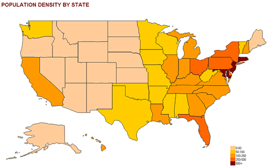
It’s amazing what you can do in Excel with shapes and a small amount of VBA. This tutorial shows you how to use shapes you can import from several sources to create a simple map. It is not intended to replace a professional geographic information system, but if you just need a basic map to add to your presentation this will do the trick.
How-to screencasts: Population pyramids in Excel
Population studies rely heavily in the analysis of population structures, and a population pyramid is almost an icon for these studies. I actually don’t like the regular chart, so what I show here is a “folded” pyramid that allows you to see the age structure but also makes sex comparisons easier.
Better Color Palettes for Your Excel Charts [fusion_builder_container hundred_percent=”yes” overflow=”visible”][fusion_builder_row][fusion_builder_column type=”1_1″ background_position=”left top” background_color=”” border_size=”” border_color=”” border_style=”solid” spacing=”yes” background_image=”” background_repeat=”no-repeat” padding=”” margin_top=”0px” margin_bottom=”0px” class=”” id=”” animation_type=”” animation_speed=”0.3″ animation_direction=”left” hide_on_mobile=”no” center_content=”no” min_height=”none”][Video Tutorial]
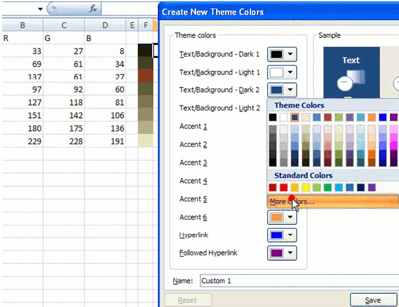
I’m not a designer and color selection is not something that I do easily. This tutorial shows you how to pick a nice photo from Flickr (or any other source), generate a color palette and add it to Excel. Then you can use it in your charts.
 [/fusion_builder_column][/fusion_builder_row][/fusion_builder_container]

