My Skillshare channel

I recently started a Data visualization channel on Skillshare where I’ll be publishing how-to classes and other data visualization content. Follow me on Skillshere if you want to know about the new classes!
Universal Chart Maker
The Universal Chart Maker e-books are the first wordless instructions manuals to make charts in Excel and Tableau. If you are not fluent in English or for some reason don’t like to follow written instructions, with these visual instructions you can make great charts that go beyond the Excel charts library and Tableau’s Show Me. Get the bundle here.
Recent visuals

How do you make sense of the impact of Covid-19 in mortality? In this chart I use Excel to display the expected ranges of variability, the actual deaths and I try to evaluate excess mortality and how it compares to official deaths by Covid-19.
Excel Experiments
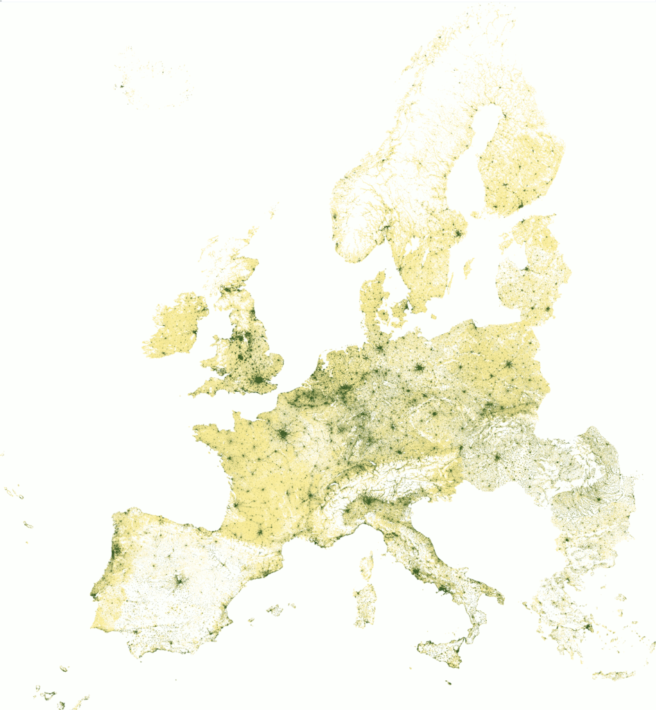
It may not seem obvious, but this is a pivot table in Excel. The is the total population in Europe in a 1×1 km grid. Since each cell in the grid is geo-referenced, it’s easy to turn it into a pivot table. Then a conditional formatting is applies and the numbers removed. The dataset contains almost 2M rows, so I was wondering if such a large number of data points could be visualized in Excel. Apparently they can.
PowerBI Experiments
This PowerBI file explores the population estimates and projections from the United Nations Population Division. It’s mostly descriptive, but in page 4, it explores the idea of redefining the boundaries of each age groups (Young, Adult, Old), depending life expectation for each country.
Recent posts
To tell you the truth, I don’t like the word “lie”: it feels obvious and unsophisticated. I prefer something like “reframing truth”, “alternative facts” or an English word I recently…
I’m still in shock. Such a stupid Excel mistake. I should know better, but it was Monday, so… Let me tell you about it. It’s as mistake as old as…
A single horizon chart is easy to make in Excel using overlapping columns or areas (the trick is to structure the data the right way). But the horizon chart is…
I need to learn PowerBI, as soon as possible (per client request). So, I spent much of last week using it. I wrote about the depressing experience on Twitter. I…
When I saw Paris for the first time I was like, meh. Not Paris’ fault. This was the second leg of a trip that started in Prague, and I was…
How do Excel and Tableau compare when actually making a chart? I couldn’t find such post, so I wrote one. I’ll create a simple chart, a population pyramid, and comment…
After creating wordless instructions for making charts in Excel, here is the Tableau version. This post discusses similarities and differences between both tools. Check out the e-books at the bottom!…
An ebook that uses visual instructions to show how to make charts in Excel. Non-English speakers should be able to follow these instructions.
It began with a tweet: Data tweeps: Help! I need to become a competent data viz thinker, well, immediately. Are there “must-read” sources that y’all can suggest? — Lindsey Leininger…
This post summarizes a few key points in my NTTS2017 effective data visualization for statistical offices