You know how useful graphs can be to to find trends and patterns in the data. But you can also use them to detect some mistakes, something that is much more difficult to do with a table.
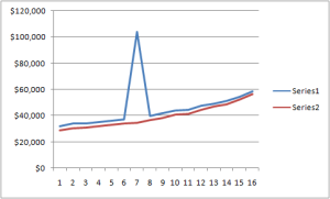
Let me give you a real world example. Is there anything unusual in this time series, anything that stands out?
No? Are you sure? Take a closer look and you’ll see it. Too much guesswork? Well, why don’t you just use a chart?
Can you see it now? Of course you can. Try not to see it…
This is clearly an error. I just fund it in this table [fusion_builder_container hundred_percent=”yes” overflow=”visible”][fusion_builder_row][fusion_builder_column type=”1_1″ background_position=”left top” background_color=”” border_size=”” border_color=”” border_style=”solid” spacing=”yes” background_image=”” background_repeat=”no-repeat” padding=”” margin_top=”0px” margin_bottom=”0px” class=”” id=”” animation_type=”” animation_speed=”0.3″ animation_direction=”left” hide_on_mobile=”no” center_content=”no” min_height=”none”][update: link removed: table no longer exists] from the US Bureau of Census (I’ll ask them to fix it).
If you need to proofread your tables start by a quick check using a chart. You can select the entire table or a single series. Look for inconsistencies and outliers. Many outliers are simple mistakes, but sometimes there is a good reason behind them.
This kind of errors is almost impossible to avoid, but the obvious ones are easily spotted, so the next time you publish a table do yourself a favor and scan the data using a chart before hitting the publish button.[/fusion_builder_column][/fusion_builder_row][/fusion_builder_container]


Charts are good for catching errors, and for finding simple patterns which are hidden in the tabulated data. See Use a Chart to See Patterns in Your Data