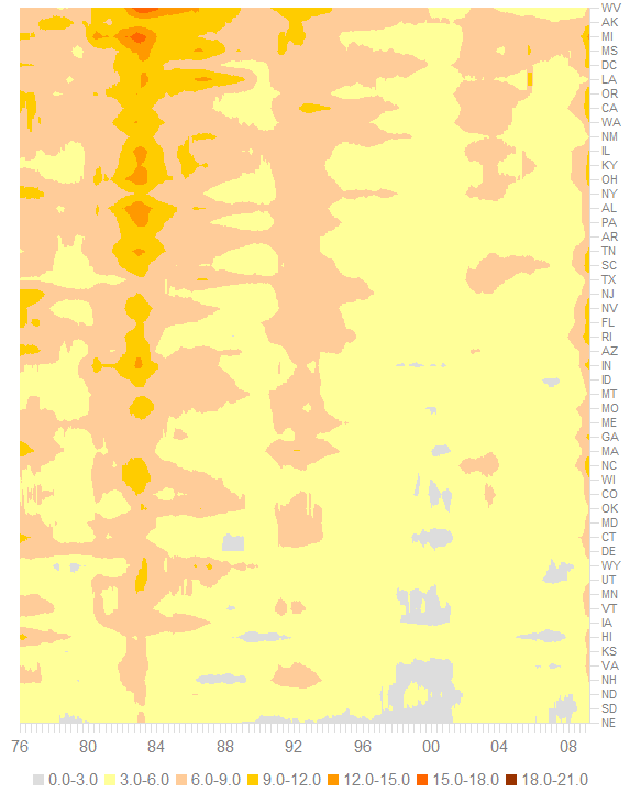
 Here are two ways to display a relatively large dataset, montly unemployment rates by state since 1976. The first one, above, is perfect to see the overall patterns, the range from the lowest to the highest, the outliers and the slopes. An interactive version would allow the user to highlight specific series.
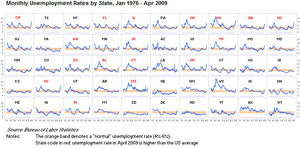
A small-multiple version allows the user to focus on specific states, compare them to the normal band, etc. States are ranked by labor force size and, as you can see, in the first row seven out of ten are above the US average in April. In the last row, only one is above the US average. You can also see that Michigan was not well (unemployment-wise) long before the current crisis, or a spike in Luisiana (Katrina). It pays to study this chart carefully.
Bottom line: try to see the same data from different angles. There will always be semething interesting to find.
What do you think? How would you improve these charts? Would you use a different display? Share it in the comments! (here is the data file)
Update: I usually stay away from Excel’s surface charts, but I’d like to add this one:

Also check Michael’s Horizon chart.

Jorge—
Interesting look at these numbers…
Did you use Excel to create the 50 small charts?
Thanks for the ideas-Jason
Sounds like a fun challange 🙂
Can you share where you got the data on the recession periods and labor force size?
I like the first chart. It’s dense, but with interactivity could be very useful.
The second is too hard to compare specific states. Only because I can’t find them! I’m not sure what order they put the states is, but it’s not alphabetical.
Jayson: The states are sorted by labor force size (it is on the text, but I should have add it as a note). Use the alphabetic order and you’ll lose this insight that larger states have higher rates. The idea behind small multiples is to show a large number of individual patterns.
@Joe: Labor force size comes from the same table in the BLS (I’ll add that sheet to the Excel file later today). “Recession periods” comes from “List of Recessions in the United States” in the Wikipedia. [Update: added labor force and recession data]
That makes sense. I swear I read that paragraph! 🙂
This might be information overload, but it is possible to add the recession strips on the small charts. This may add some context to the various peaks and valleys.
Horizon charts can display this type of data. Here’s one for the unemployment rates.
@ Michael: Interesting graphs, but they seem to muddled. I can’t follow one state across. It seems an excellent way to see how states are doing across the board, but not easy on the eyes for individual review.
Also, and this is probably just me, but even though I see and understand the color key, my brain sees no color (8.3% – 16.7%) and thinks that there was very little unemployment during that time. Seems like the colors should progressively get darker.
@Jayson: Yes, definitely not great on fine detail for an individual state.
I should have been more careful since there are no negative values in the data. Try this one.
That link is broken, it should this.
@ Michael: The color change makes the whole thing more readable. Looks good!
@Michael: Great chart, thanks. In this case, I would try to find a better sorting key. This prompted me to try something that I usually avoid, Excel’s surface chart (I do prefer the horizon chart).
@Jayson: I played with the vertical strips but the the display was getting too cluttered. Perhaps I’ll try again with a lighter gray.
Hi Jorge. Great series of posts. A comment on this one.
You said [A small-multiple version allows the user to focus on specific states, compare them to the normal band, etc. States are ranked by labor force size and, as you can see, in the first row seven out of ten are above the US average in April.] – Actually, these small multiple charts show deviation from a target band i.e. a range encomassing the ‘normal unemployment rate’ – presumably national. This is just a flat, unseasonal, uncyclical average. So these charts do not show deviation from the national average.
I’d actually plot them as deviation from the average – makes for much easier ‘detrended’ comparison of how one state compares to another. I’ve sent an excel 2007 file with an example to you care of this domain.
Regards
Jeff
Ahhh – I misinterpreted what Jorge was saying. Somehow I missed that where he says ‘in the first row seven out of ten are above the US average in April’ he’s referring to the fact that the chart labels are color coded to denote deviation from average, but not the series themselves.
That is, he colored the state code red if the unemployment rate in April is higher than the national average and black if below that average, and his comments refer to this color coding.
Plus I’m wrong to say that each small multiple displays the deviation from a target band the actual unemployment rates – instead, the target band just helps to highlight how the various rates compare against a static ‘natural employment’ range.
Doh!
Nice visualization. Particularly the top version. Thanks for providing the data file.
Yes 🙁