We know how popular pie charts are in business presentations, but pie charts and infographics is a marriage made in heaven. Let me share with you 16 cool ideas to add pie charts to your next infographic. I’ll add a brief comment to tell you what makes each unique and link-worthy. Please note that these are simple drafts in Excel. Adding makeup is your job 🙂
1. The accidental nightingale
The first pie chart is for the data visualization crowd out there. They’ll love it. Shrink and enlarge slices at will but don’t change them based on actual data. You want to be free from that mundane realism.

2. The sub-prime
Using a pie chart to display growth sends a very powerful message: “There is no negative growth. Enjoy life. Silly.”

3. The Judas Cradle
You don’t want to know what the Judas Cradle is, but this pie chart variation will do something similar to your audience’s minds. How cool is that?

4. The pendulum
The reader will be moving his/her head from the legend to the pie and back. Nice physical exercise and great feedback: place the legend below the chart for Yes or on the right for No.

5. Inverted Gestalt
Gestalt psychologists say that “the whole is greater than the sum of its parts”. Now put the sentence upside down for a fresh perspective: “the sum of its parts is greater than the whole” . Use slices that total more than 100% and you’ll get lots of links from the whole data visualization community. This is subtle, please use it carefully.

6. Gestalt Plus
This is pure gestalt. Show the total itself and you can be sure that the whole indeed is greater than the sum of its parts.

7. Alpha-Beta
Sort the slices in a pie chart alphabetically and your audience will stay longer, trying to figure out the largest slice, and the next one, and the next one… Endless fun.

8. History repeats itself
Everyone knows that history repeats itself as a farce. Since time is circular, pie charts are the perfect tool to display time series. Do it properly and the reader will start spinning around too. Try it!

9. So much to say
If there is much to be said, just say it. Add every single slice you can find (check under your bed too). You have a clever audience, they know what is relevant and what is not. Right?

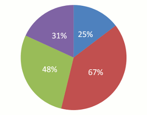
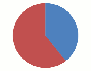
10. Keep it simple
If your audience can process simple messages only, or you’ve left too much empty space to fill, a pie chart with two slices is a good starting point. If the reader needs more, use the chart above.

11. In the shades
This is so mesmerizing that your audience can’t even click the back button. They’ll keep counting how many shades there are and trying to correctly connect them to the legend.

12. The Rack
Leave my site and this is what I’ll do to you. Scary!

13. The real thing
Nowadays you can make a pie chart look so real that the readers will want one in their living rooms.

14. Retro chick
Oldie, but goodie.

15. Best friends
This is also an effective way to make your visitors stay longer on your web page, trying to figure out the differences between slices and between pies. Use several pie charts for extra points.

16. Bending the bars
This is what you get when you cross a pie and a bar chart. Simple, elegant, no boring axis and very link-worthy.

Now, seriously, let me put it this way: you can use this post as a source of inspiration for your linkbait infographic or you can read it as 16 things you should never do (or accept) when communicating with data. Which one will you choose? Tell us in the comments.
If you’ve enjoyed this post please consider sharing it using the Share button below. Thanks!
Most delicious! Shareable even, if saying so about pies can be taken as a compliment.
Sorry… I do not use Pie Charts. Pies are meant to be eaten not displayed as graphs.
My main argument is that the sizes of the slices are visually very difficult for audiences to interpret. Also when you have many slices, labeling can be a nightmare.
A bar graph is almost always better. The only exception I can think of is if the pie chart only has 2 segments.
Please let me know if you have a counterpoise to this argument.
Check Stephen Few’s “Save the Pies for Dessert” for an argument in favor of pie chats 🙂
Check also the last sentence in the post. I don’t make infographics.
Thanks.. read to fast to see the sarcasm…
This should have been presented with nice pie charts showing the relative increase in links and views when using these different pie charts.
Seriously though, after the first pie chart I was thinking “ouch, ever heard of area conservation?”, but after the second one the rest was read with a good laugh.
I prefer cheesecake.
Few says that all things circular are bad for you. Unless you prefer those heart-shaped cheesecakes…
Awesome. Informative and entertaining in one slice….so to say 🙂
Thanks, Jorge
Thank you so much for the laugh.
How do you create the bendable bar pie chart?
I often write articles on my own blog (http://peltiertech.com/WordPress/) and say XYZ shouldn’t be used for ABC reasons. Invariably someone responds with a question about how to do the thing I advise against.
With a doughnut chart…
As of today, Google returns 347,000 for the exact phrase “my kids don’t listen to me”. The root is probably the same…
You had me freaking out until you last paragraph. Phew! Another pie chart disaster averted. Thanks for the laugh!
Unfortunately, people are going to take this seriously and implement some of them in their presentations…so sad that people would even think that’s a reasonable thing to do.
Unfortunately it’s easy to find pages where each of these examples are used seriously.