I’m sure you’re familiar with the Walmart growth map. A basic visualization looks like this:
 Obviously this has a lot of potential for a more design-oriented approach, and there are many examples online. Here is the map created by Nathan Yau at FlowingData:
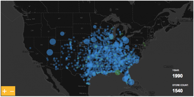
I wanted to play with the data too, but from an Excel user perspective there isn’t much to add, if any. Unless you take a different path. Perhaps a business perspective. For instance, the maps above can’t answer a simple question like this: “in 1986, approximately how many people were living within a 10-mile radius of next Walmart store?”
The answer seems straightforward: geo-code population, geo-code stores and calculate the distance, between the two, for each store. Then make an Excel dashboard like this, without VBA (click to enlarge):

Not so fast. Let’s start with population.
Population
In the first map, each gray dot represents a county and a certain amount of population. But think about it for a minute. Imagine that there are two buildings in the county only. One is the store itself, the other one is a skyscraper where everyone lives. When you measure the distance between the store and the building the error is negligible. But that’s not what really happens, is it? So, how do we define an acceptable point in space as the point where all population in a county lives (we can’t afford to calculate distances for each single address)? Take a look at this diagram, it represents a county with a city on the top right corner: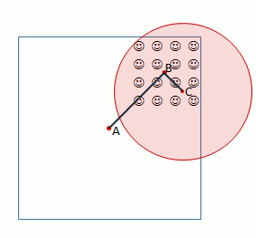
Usually, when you want/need to use a point to represent a region the geographical center (A) is chosen. This is not the ideal solution when you need to calculate distances. Let’s assume that there is a county with only 16 inhabitants, and they all live in a city. When Walmart moves in it will open the store where people actually live (C). The catchment area in a 5-mile radius is represented in red. As you can see, everyone lives within that radius.
Problem is, if you assume that everyone lives in the geographic center when you calculate the distance between A and the store C population will fall outside the 5-mile radius. This is specially important in rural areas, where counties are much larger than in urban areas. Clearly, you need a different center, like the mean center of population (B). That would be much more accurate. Luckily, the US Census Bureau calculates the center of population for the US as a whole but also for each county (you can get the data from here).This can help improve accuracy, but it isn’t perfect. In the diagram above, if there is a city at the bottom left corner with the same population, geographic and population centers would overlap and the calculations would be wrong for the county. Please also note that population centers are dynamic: each year they move a bit, depending on local population dynamics. The good news is population centers are just the starting point, you can manually define a different center.
Assuming that not all the stores were open in a single year you may want to have year population estimates. You can download the data from the National Cancer Institute.
The Stores
If you have a list of stores then you have a list of addresses, and you must geo-code those addresses. It’s impossible to list all the available options you can choose from. Here are a few ideas: if you have a small list of stores and you can easily identify them from above, Google Earth may be an option. Batch geo-coding is also an option, using a site like this (inspect the results: there will be a few misplaced addresses). If you don’t have/need a complete address but you have a list of zip codes, you can use the Excel lookup functions to find them in this database.
Calculating distances
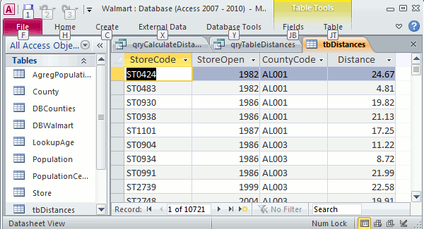
Now that you have your population and stores geo-coded, it’s time to calculate distances between all possible pairs store/county. In Excel, you can do this in VBA using nested loops. If you want to avoid VBA you have to make a table like this one:
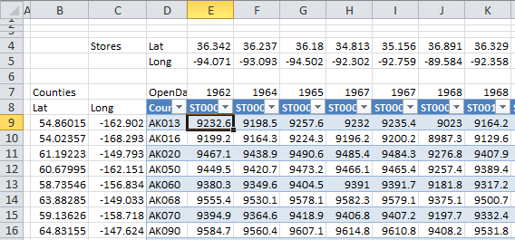
So, in each column you have, for each store, latitude and longitude, opening year, store id code and distances from the store to each county in the US. In each row, you have the counties and their latitude/longitude ( the population center). To calculate these distances you can use the following formula for cell E9):
=ACOS(COS(RADIANS(90-$A9)) *COS(RADIANS(90-E$4)) +SIN(RADIANS(90-$A9)) *SIN(RADIANS(90-E$4)) *COS(RADIANS($B9-E$5))) *3958.756
This is something that you have to do only once, then you can remove the formulas. I actually prefer to use Access to make a table with the pairs of coordinates I may be interested in. Assuming that you have a County table (county id and coordinates) and a store table (store id, coordinates and opening year) create a new query without joining them. This will create a table with all possible pairs: 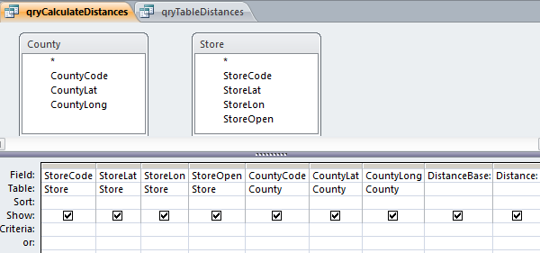
Now, since some trigonometric functions are missing in Access, I suggest that you add two calculated fields, DistanceBase and Distance:
DistanceBase: Cos((90-[fusion_builder_container hundred_percent="yes" overflow="visible"][fusion_builder_row][fusion_builder_column type="1_1" background_position="left top" background_color="" border_size="" border_color="" border_style="solid" spacing="yes" background_image="" background_repeat="no-repeat" padding="" margin_top="0px" margin_bottom="0px" class="" id="" animation_type="" animation_speed="0.3" animation_direction="left" hide_on_mobile="no" center_content="no" min_height="none"][CountyLat])*0.017453293)*Cos((90-[StoreLat])*0.017453293)+Sin((90-[CountyLat])*0.017453293)*Sin((90-[StoreLat])*0.017453293)*Cos(([CountyLong]-[StoreLon])*0.017453293)
Distance: Round((Atn(-[DistanceBase]/Sqr(-[DistanceBase]*[DistanceBase]+1))+2*Atn(1))*3958.756,2)
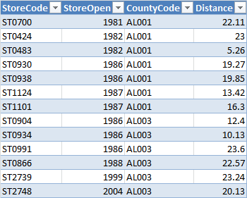
For a a dataset like the Walmart stores you’ll get a table with more than 10 million records, but you only need a small fraction, because the catchment area for each store is relatively small. Let’s assume that the largest radius we are interested in is 25 miles.Use this query to make a new table. This new table contains SotoreId, Opening year, countyId and distance. Filter for Distance<=25. As you can see, only 10721 records remain. That’s manageable, even in Excel.
All the data is stored in Access. No it’s time to add a connection for each relevant table between Access and Excel, in table or pivot table format.
Tables for the Excel dashboard
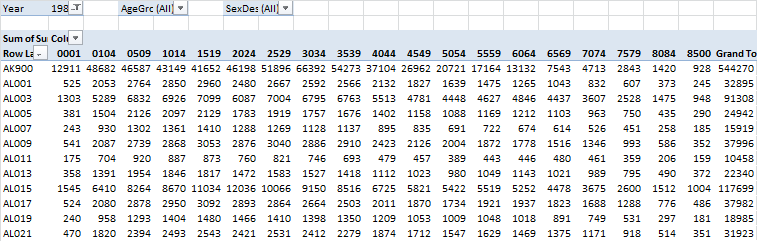
Let me show you all the tables I’m using. The first one contains population data, county by age group (“3034”, for example, means age group 30-34). Page fields allow you to select Year, large age groups (young, adult or old) and sex.
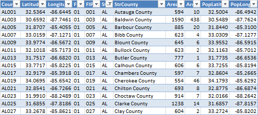
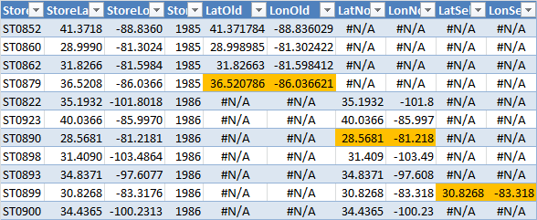
The next one is the original Walmart dataset, with a few more fields (county and state codes, latitude, longitude):

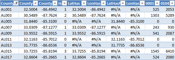
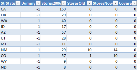
And this is the county dataset, with codes, geographic and population centers:
Take a look at the dashboard above. The map is just a scatter plot with five series, two for counties and three for stores:
- County dot: if there is no store in the county and the county is beyond the maximum distance (defined on the left), than is a gray dot;
- County dot: If there is no store but the county falls within radius, then it is an orange dot;
- Store dot: if it is an old store (not opened this year) then it is a dark blue dot;
- Store dot: if it is a new store, then it is a large light blue dot;
- Store dot: if it is the store selected from the list below, then it is a red dot.
Every time the user selects a different year there must be a table that dynamically calculates how many stores fall within the radius. If one or more, a formula gets data from the population table, if not, it returns zero. This is calculated in the next table:
The table also creates the gray and orange series (that’s the meaning of the #N/A above, there is nothing wrong with them).
The next table evaluates each store state (old, new or selected) and creates the series for each state:
Remember the distances table we created in Access? Here it is:
And the last table calculates data at state level for the remaining charts:
There are two remaining sheets, a sheet to store data for the controls and another one to calculate the data for the population pyramid.
This was done in Excel 2010 because I wanted to control the population pivot table with slices, but it can also be made with Excel 2007 with a small macro to perform the same task.
In this case I’m using the Walmart dataset, but once this structure is in place you can easily replace it with your own list and add more data to the dashboard.
Catchment area analysis is much more complex than this, but can and Excel dashboard like this be useful as a starting point? How would you improve it? Please share your comments.
By the way: the answer to the above question is 48 279 951, 20% of total population.
[Registered users of the Demographic Dashboard courses can freely download these files from the Lookup Resources module.]
[/fusion_builder_column][/fusion_builder_row][/fusion_builder_container]
Wow Jorge! This is one extensive exercise!
Thanks for sharing.
Ravi.
Hi Jorge
What a great and detailed article with really clever ideas. This has inspired me to improve the dashboard I’m making which plots out my future trip in Europe… I was struggling with a useful way to measure distance by air – so your distance formula will be very useful.
I love the distance information you’ve addded. Did you consider using the google directions API (https://developers.google.com/maps/documentation/directions/) to do this work? It could add more info about the actual road distance and travel duration. I suppose the limitations with this are the API limit of 2500 queries per day and the fact that the population centre is an estimate. However, it wouldn’t take long to develop a database with this information (running some VBA for five days) and it might produce interesting results. For example, there may be similarities in the distance by car between population centres and walmarts, or perhaps average duration of travel.
Really interesting work – looking forward to the next installments.
Tom