I’d love to make my broken English more Tufte-compliant. I’d love to make the design of ExcelCharts.com more Tufte-compliant. I’d love to make my home office, my lifestyle, my… you’ve got the point. It should be easy: here is a framework I am comfortable with, now I just need to translate it. It isn’t. I’m not alone: bloggers-about-blogging can’t make a decent chart.
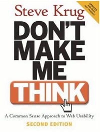
Don’t Make Me Think
Take web usability. Good web usability and good data visualization share many principles. Let me show you. I’ll use Steve Krug’s Don’t Make Me Think.
Dashboards and Web Pages
When you arrive at a new Web page, many question marks start to pop-up: “what is this site about?”, “where do I find…?”, “can I click here?”. The fewer question marks, and the faster they are answered, the better. That’s why Krug says that self-evidence is the first law of usability. He writes:
As a result, if Web pages are going to be effective, they have to work most of their magic at a glance. And the best way to do this is to create pages that are self-evident, or at least self-explanatory.
Now, compare this with Stephen Few’s definition of “dashboard”:
A dashboard is a visual display of the most important information needed to achieve one or more objectives; consolidated and arranged on a single screen so the information can be monitored at a glance.
What is the difference?
Reading and Scanning
People don’t read web pages, they scan them, “looking for words or phrases that catch our eye”. So, what do you do? “If your audience is going to act like you’re designing billboards, then design great billboards”. Your chart must be clear and to the point. A chart is not flat. If you emphasize everything, nothing stands out.
How to Design a Billboard Chart
Krug’s advices on how to design pages for scanning, not reading, can easily be applied to chart design too:
- Create a clear visual hierarchy where the more important data stands out, while contextual data is left on the background;
- Use conventions (because “conventions are your friends”). Time runs from left to right, so use that convention when displaying time series. Your first chart defines a convention: if product A is orange it should be orange in all the remaining charts.
Omit Needless Words
I must quote this:
Getting rid of all those words that no one is going to read has several beneficial effects:
- It reduces the noise level of the page;
- It makes the useful content more prominent;
- It makes the pages shorter, allowing users to see more of each pare at a glance without scrolling.
This is the realm of the fluff, the eye-candy, the wow factor. Let’s review some of our needless words:
- Texture:
- Grid lines;
- “Interesting” data;
- Clipart and the like.
I could go on and on and on. Read the book. When the author writes “web usability” think “data visualization” and “charts” instead of “pages”.
Finding similarities is the easy part. Knowing what to do with them and actually implementing those principles in a blog design well, that’s much harder. That’s why many data visualization blogs are ugly, I suppose.
What good examples of well aligned blogs (data visualization principles vs. blog design) do you know of?
