Corporate annual reports and the Wikipedia are two great resources to find really bad charts. We can’t do much about corporate reports, but we can actually change the Wikipedia articles. So, here is an assignment for you: find a bad chart and replace it with one that actually makes sense from a data visualization point of view. Do it once a month.
Here are a few examples to inspire you. If you like data visualization and don’t feel embarrassed by these charts, I don’t know what will motivate you.
Throughput Accounting : (file)
Mauthausen-Gusen concentration camp : (file)
List of U.S. states and territories by population : (file)


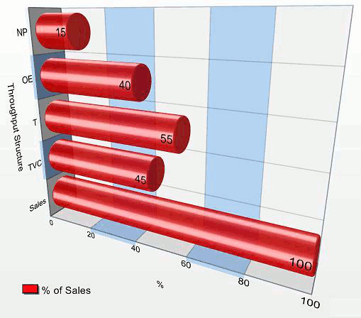


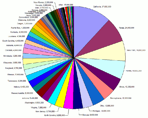

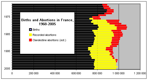
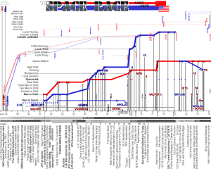



Oh man Jorge this will be a blast. We’ll make wiki a better place and probably piss off some wikipedians in the process.
ftw.
http://en.wikipedia.org/wiki/Chart
We should start there.
hehe nice idea! would be fun to track the improvements as well (by leaving a comment here for example)
Dan: I do hope so. And they’ll thank us… (why wouldn’t they?)
The banana export chart and the Ukranian Parliamentary Election ones are the worse charts I have seen in my life….(at least that I remember). I think Ill have nightmares tonight….
Oliver: I was planning to stick to the English Wikipedia, but I couldn’t resist the the banana chart…
Well, they’ll either thank us, or we’ll all just get banned. 🙂
I’m doing a few this weekend. I’ll post here.
Hi Jorge,
I took the first one, it’s really annoying … invented some data … and built a stacked-column chart with our graphomate Addon for Xcelsius: http://blog.graphomate.com/?p=395
Took me a minute 🙂
The best, Lars
Some great examples here of using judgement in whether or not to use some of Excel’s functionality. I may take you up on this assignment!
Oh God Save Me! What a chart!
Jorge,
I would love to see how you are going to change the Banana chart!
Well, I’m having second thoughts on this.The Banana chart is a monument, an unique piece of bad taste and bad visualization. We should leave it for future generations to see and understand our times. We should replace the other ones though.