We often learn a lot more from bad examples than from the good ones. So, here is a really bad one (you can find many examples like this in corporate annual reports…). So, what’s wrong here?
What do they want to say?
If you don’t know what to say, you probably should keep your mouth shut. Are we supposed to compare proportions? Are we supposed to compare 2005 to 2006? We are clueless, so is the author. This is what happens when you use charts to illustrate some numbers. A chart is an argument, an answer to a specific question. Don’t start answering without knowing the question, unless you are a professional politician.
Wrong chart
And since you don’t have a question, you can’t frame your answer. You start babbling incoherently, hopping that your amazing graphic design skills can save you. They don’t (and, by the way, templates and canned effects are not substitutes for real skills). So, what is the question about? Trends? Relationships? Proportions? There is always the right chart.
Wrong Title
While there is nothing inherently wrong with descriptive titles (“Sales by Product”), I do prefer the “as-you-can-see” title. If sales are growing, why don’t you say it in your chart title? “Sales are growing” (as you can see). And you can use titles to connect charts and get a consistent message.
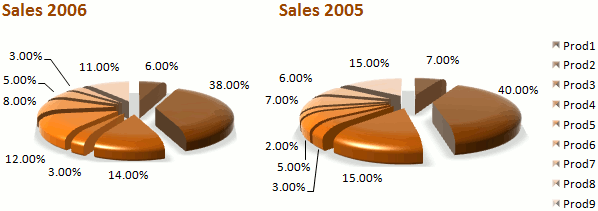
Don’t mess with time
I would call this “misplaced recency”. Everyone knows that, at least in the Western societies, time flows from left to right. If I see 38% on the left and 40% on the right I’ll assume that the slice is growing. But apparently its the other way around. Conventions work. Stick to them if you don’t have a good reason to break them.
DON’T EMPHASIZE EVERYTHING
If you label every single data point in a line chart; if you use primary colors only; if you explode every single slice in a pie chart, then you are yelling at the reader, while you render the chart unreadable.
Too much data
Exercise your editorial judgment when making a chart. You are the expert. You must know what makes the cut and what can safely be removed or grouped.
What is what?
When color-coding and labeling your chart, make sure that each series is clearly identified. That’s not the case here. And only use a legend if you must to. Label the data points in a pie chart and the label the series in a line chart.
Alphabetical sorting? Never!
I wrote about alphabetical sorting recently. Don’t ever do it. The sorting key must come from the data itself. When you sort the data using an external key you are hiding the patterns. A chart is not a table.
Remove decimal places
If you are a precision freak I am sure you hate charts. If you are not, then remove decimal places from axis and data point labels. Remove the percentage sign too (place it near the axis or in a sub-title). Do the same with large numbers (1 instead of 1,000,000).
They look professional, don’t they?
Professional-looking charts? The wow factor? Memorable charts? Don’t make me laugh. Yes, we are attracted to shiny things, but, well, not all that glitters is gold. From the Wikipedia:
Panning for gold often results in finding pyrite, nicknamed fool’s gold, which reflects substantially more light than authentic gold does. Gold in its raw form appears dull and does not glitter.
I rest my case, and I think I’ll copy this paragraph to the Data Visualization article.
This is not about pies…
Tell me the true: you though I was going to write yet another blog post about pie charts and how evil they are, right? Sorry to disappoint you… But I admit: it’s easier to make all these mistakes in one or two pie charts.
Great find. It’s a symphony of bad design and a wonderful example that will get some use in my office. 🙂
Matt: glad I can help :). Well, I’m lazy and it’s very easy to find examples like this. Good examples are much harder to find, specially if you are looking for them in the wrong places (like the annual reports)…
Funny story: I’m using a well-known application to help me write the plan for my consulting business. Problem is, all the default charts are wrong (pies, 3D, primary colors…). Apparently I’ll have to export the report and replace all of them. I’m seriously tempted to leave them and add a serious version below.
Using examples of what not to do is probably the easiest for those of us trying to break people of bad habits. This is a gem.
And I relate to your story because we have a reporting system that the accounting & grants department uses. Everything it produces is rife with chartjunk. As you just suggested, when we need to build a proper chart, we have to rebuild the things from scratch. There’s no shortage of eyeroll worthy stuff we’re forced to look at, right?
Informative article, i liked in particular your “bad chart” approach as opposed to the generic “good chart” one. I stumbled across this when I was researching for a similar topic- a post entitled “Which chart should I use and when? A guide to dashboard charts”. You may be interested in reading it considering your interest in this area. I would welcome your thoughts on it too. You can access it here: http://bimehq.com/data-visualization/which-chart/
Some great points to remind us what to avoid, and more importantly why. I just wanted to comment on your “don’t mess with time” point.
While normally, as you say, time is “expected” to flow left to right, the convention in company accounts (at least here in the UK is to present the latest figures (ie the year to which the report relates) in a table first (ie on th left), then left-to right show figures for preceding years for comparison. Sometimes the current figures may be highlighted in some other way as well, such as being in bold.
So if the charts here appeared on pages with data tables arranged this way, and the intended audience (eg potential or existing investors) are familiar with this convention, then time flowing right could be a domain-specific convention for company annual reports / accounts.
Good stuff here. Really helped me with a project for my business investment projection spreadsheet I made. I was seeking to express my results at the end of my workbork. It also helped me in a class I am taking in school. This program is sooooooo powerful! 🙂