In data visualization, animation is overrated. OK, it’s an interesting option if you can see a clear pattern emerging when displaying data over time/space (and, thanks to animation, we were introduced to this communicator extraordinaire named Hans Rosling).
It’s fun to make an animated GIF like the one above, but you must see animation as a component of interaction. The tool you are using must let you pause and explore, like Rosling does with Trendalyzer and Gapminder Desktop.
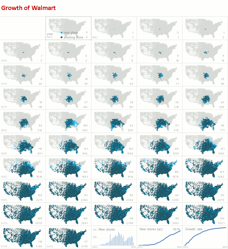
Instead of a movie, why don’t you take a look at the individual video frames instead?
As you can see, the spatial pattern is still there, and you can easily compare individual maps.
By the way, you’ll probably miss spatial patterns if you use a regular chart. You should always check for this patterns when you have a dataset with a spatial dimension. But don’t assume that the story ends there. Remove this dimension and you’ll find other (and often more interesting/useful) patterns. Compare the small multiples above with the reorderable matrix below:
The spatial pattern is powerful (a “wild-fire”) and memorable, but if I had to choose, I would choose the reorderable matrix. Lots of interesting and more precise details there that you can’t see in the map, and you still have a glimpse of the regional pattern via color coding.
I actually like this sequence… It starts with a bang and then you can calmly explore the spatial patterns and the other details.
What do you think?
PS: You probably know the much better-looking map Nathan posted a while ago with this data set. That’s where the original idea for this post comes from.
PS2: Next week we’ll see the result of combining counties (the gray dots in the maps) with store location. Stay tuned!


Jorge –
Great post. I especially like your reorderable matrix. While not initially as eye-catching as the map, it lets you see when there were growth spurts, especially into new territories. See TX, GA, and FL in the mid-80s, or NY, PA, and CA in the early 90s.
Given a choice, I would always prefer to see all three of these views, the animated map, the map small multiples, and the matrix of bar charts by state.
Interesting discussion. Static is better than animation. The reoderable matrix is the best option. I would however have preferred the states to be on the left; on the right they seem to stand against time stopping its flow.
Jon raises an interesting issue – he would like all three views – I agree with him as far as the last two are concerned, i do not know if we gain any further information form the first animated option.
Thanks Jon. We often forget that, not only there are several learning styles, but also that even with similar learning styles people react differently. And each visualization offers a different perspective.
Paresh I was actually planning to add labels to both sides…
I agree with you but as I said in the post, animation without interaction doesn’t make much sense. Even without interaction, animation can show you the main patterns and make you curious and willing to explore further.
Hi Jorge
I believe that the animation would only serve to distract attention. Rather than focusing on the graphic, the readers would be caught up wondering how you created the graphic [ there is technical prowess no doubt ].
Paresh –
I don’t totally agree (nor totally disagree). While there is the danger that the animated chart could be distracting, sometimes animations are what is needed to draw in one’s attention, to the more detailed graphics. As Jorge says, to make you curious and willing to explore.
Hey,guys,
As far as i know,data visualization is to make people understanding the core logic or things easily;The best part of animation may help people seeing what was changing in a long time;
Hi Jorge,
I for one, love the animation in the chart.
Is there a tutorial video for this and an xl file…
Do you plan to cover any animated charts in the dashboard videos for members ?
Mustafa
Great post, Jorge. I actually prefer the small multiple map approach mainly because I find the overall pattern and spread of the stores across the country (radiating from the original store in Arkansas) intriguing. Learning about the number of stores in each state–as in the reorderable matrix–isn’t as compelling to me. It’s of course a preference and based simply in the story I find more interesting.