Over the last few days I came across some really WTF visualizations from respected people and organizations here. They all share the international language of bad design, so I’m sure you don’t need to know Portuguese to (not) understand them.
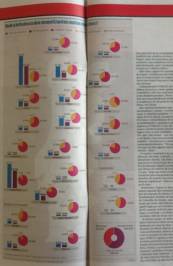
Público, a newspaper:
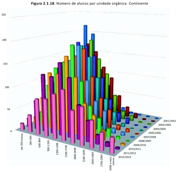
The National Council of Education:
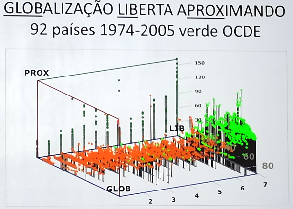
Jorge Braga de Macedo, an economist:
FFMS, a foundation who’s mission “is to study, disseminate and debate Portugal’s situation freely and independently”:
The featured image is also from the FFMS. The pie (?) charts are both bad and wrong.
I actually know some of the people who are supposed to approve these things and I deeply respect their (not-datavis related) work. I don’t know if the problem is some work overload, lack of awareness, delegation or bad choice of a design agency. But it’s embarrassing and depressing, even if it means a huge market (the classical example of the shoe salesman in Africa). Hope things improve in the future.


