There is not much of a story in the expected evolution of US population, according to the United Nations estimates and projections (1950-2100):
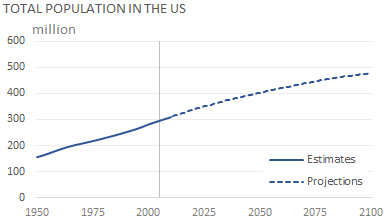
(You’ll see in a moment why there is a vertical line in 2005.) Things get a little more interesting if you split population by age groups. You can see that population is getting old at the top (more elderly people) and at the bottom (fewer children):
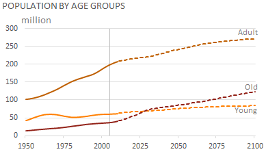
In population studies, there is a very useful dependency ratio, a ratio between Young and Adult population (Young Dependency) and between Old and Adult population (Old Dependency). Now, think about Jon, a baby-boomer. He was born in 1961. You can see him in the orange series. And you can see him again 65 years later:
A strange scenario
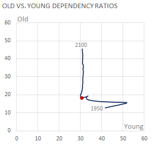
It is clear that, while the young dependency ratio remains flat, the old dependency ratio sharply increases as soon as the first baby boomers enter old age, by 2011. But what happens if you plot a ratio against the other?
Here is our L-shaped trend, where the red dot marks 2005. There are several things at play here. The first one is, obviously, the impact of baby boomers. But you must see it in the context of the long-term demographic transition (from high birth and death rates to low birth and death rates). And there is a model of the projected fertility rate (in this case, the so called “medium-fertility variant”).
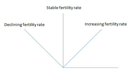
There are basically three scenarios. The line always goes up. If you assume that fertility rate remains stable then you get a vertical line. If you you assume that fertility rate keeps declining, the line bends to the left, and if you are an incorrigible optimist and you believe that couples will start having more than two children again, then the line bends to the right:
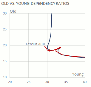
I don’t like L-shaped trends, so I wanted to see how well the model is predicting the actual ratios. Here is a zoomed-in chart with estimates from the US Census and actual data from the latest census (2010).
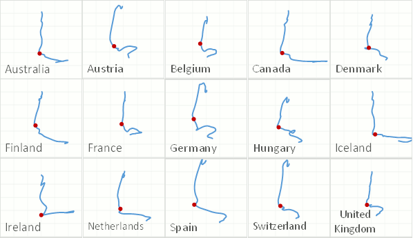
Apparently, things are getting worse than predicted by the model: the old dependency ratio is going up (you can’t do much to change that) but the young dependency ratio is not frozen at the 2005 level (Americans are making fewer babies than expected). The US is not alone. Here are a few countries with a similar pattern:
And the largest ones:
So, unless a country is planning to kill or export its older citizens, its old dependency ratio is likely to keep increasing over the next years. Assuming that you don’t have much control over the number of elderly people, your only option is to play with fertility rates. Given current economic and financial uncertainty, I don’t know how fertility rate can increase.
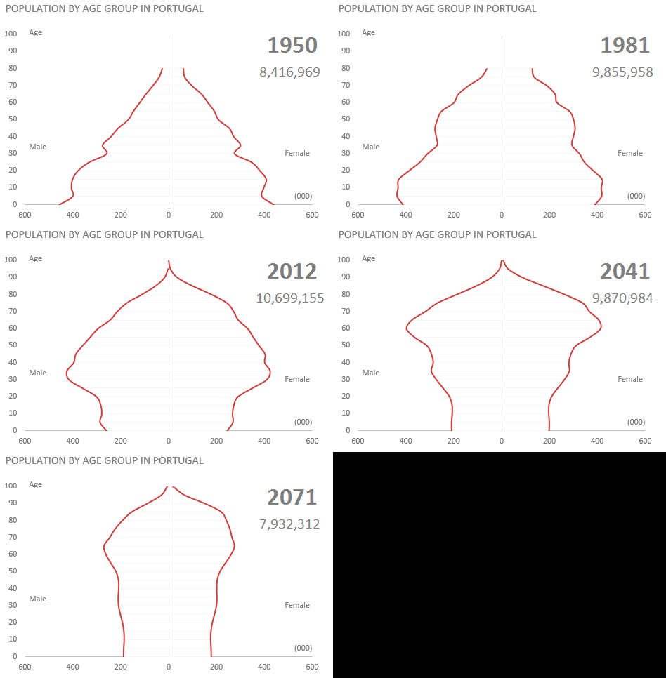
The incredibly shrinking country
If the model is right, many countries will have to deal with an over-sized elderly population followed by a dramatic decline of total population. Here is the UN data for Portugal (in 1990 the 85+ age group is split):


You are incorrect that a country’s only option to change these demographic trends is to ‘play with fertility rates.’ Have you never heard of immigration?
Very interesting post and (in my opinion) great use of an animated chart. Keep up the good work.
It’s a little bit scary but the last chart is really powerfull. Very good article !
Very interesting but to nit pick, is there something wrong with the y scales here? The population chart shows adult population just under 300M and young and old near 100M so the ratios should be near 3, or 4 not ten times that amount.