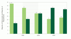
Nathan asks us Can You Improve this Mediocre Statistical Graphic?
Since there are only two series (two parties) with a obvious mirror effect, I would say it doesn’t make sense (from a chart economy point of view) to display both series. And since the 50% mark is relevant in election results, why shouldn’t we just look at the trend of one of those parties around that mark? It would help to tell a more interesting story.
So, this is my radical suggestion, with Bonavista’s sparklines:
“The percentage of counties in California that have a Democrat majority of registered voters in Presidential election years droped sharply in the last four elections and now stays well below the 50% mark (  ). Loren ipsum….” (I have to work on a better integration of sparklines and the blog template, but you get the idea…)
It would be nicer to have more data points, but this small footprint chart conveys the essencial message. Of course you can follow the standard approaches (a line chart with both parties or a stacked bar chart). As always, it all depends on what you want to say and how you want to say it.

Jorge –
I find this chart potentially confusing because (a) there’s no indication of vertical scale, (b) the difference from 50% requires extra mental processing, (c) mixing of colors for a single series makes in unclear, particularly when one of the colors (red) is often used to denote the party which is not the one shown in the chart.
I’ve designed an alternative sparkline (image) and describe it in my post California Majority Party by County.