We already know what a chart is, but how do you make one? That deserves a few pages in this tutorial.
Let’s have a quick overview of the whole chart-making process before detailing each step. But first, let me remind you that a chart is a knowledge-building and a knowledge-sharing tool. Don’t make a chart just because you have an empty slide and you want to illustrate some numbers. Charts are great to fight information overload, but we don’t need a chart overload.
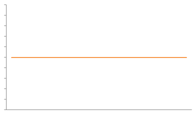
That said, take a look at this chart:
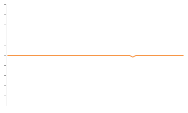
Do we need a chart to tell us that nothing is happening? What about this:
It may be just a blip on the radar, but something happened. There seems to be a problem.
A problem. That’s your starting point. And a problem brings up questions: what happened? When? Who’s involved? To answer these questions, we need data. Is the data available and updated? Can we use it? Do we need more detail?
Depending on the questions and on the data, you decide to go visual (making charts) or calculate a few statistics (or both).
Let’s assume that, after looking at the data, you still think that making a chart is a good idea. “I’m sure there is a lot of interesting stuff to uncover in this dataset“, you tell yourself. Stuff like patterns, relationships, trends.
Beware now: interestingness and relevance are not the same thing. Make sure you have clearly defined priorities and use them to judge relevance. This doesn’t mean that you should over-simplify a complex reality and force the data into a fixed framework. Don’t reduce it to a single chart. Play with multiple perspectives and choose the ones that add real value to your analysis.
After all this exploratory work it’s time now to share what you’ve learned. Select the charts you need to tell your story, find the right sequence, format them to improve effectiveness, add titles, footnotes, annotations. Add some makeup, but don’t go overboard. Keep your audience in mind.
Let’s detail these steps. In this page we’ll discuss how to come up with useful questions.
Ask a Question, define the problem
This is truism: you start understanding your problem the moment you start asking the right questions. Asking good, non-biased questions, is not as easy as it seems. Probably every single market researcher in the world is willing to share a funny story about the questions clients wanted to add to their questionnaires (if you know some, please share them in the comments). I will not tell you to spend one hour perfecting each question, but at least perform a basic forensic analysis.
Let me give you an example: “Our sales are declining. Why?”. I already see endless meetings and as many interpretations as the number of persons in the room…
- What do you mean by “our”? What companies, products, sales channels are included?
- And how do you measure “sales”? Dollars? Units?
- What about “declining”? Are our sales declining if we are selling more units at a lower price? Are we selling less but gaining market share because we out-grow the market? Are we not meeting our impossible sales targets given the current economic environment?
- Actually, we should split this into two questions: a descriptive one ( “are our sales declining?”) and an explanatory one (“Why?”). You shouldn’t mix them up.
Not everything can be applied to chart-making, but I suggest you to read the questionnaire design section in a good market research handbook. You’ll get many useful tips on how to write your questions and what pitfalls to avoid (and how).
What to ask: try depth & breadth
If it’s not obvious for you what type of questions you should ask, you can try a depth & breadth approach.
We use pie charts to display proportions, line charts to display trends, xy charts for relationships and bar charts to compare things. Proportions, trends, relationships, comparisons are great starting points to write your questions, like:
- What’s my current market share? (proportions)
- Am I gaining market share? (trends)
- What is the impact of advertising budget on sales? (relationships)
- How do I compare to my competition? (comparisons)
This is the breadth analysis, where you multiply your points of view.
Now focus on a single point of view and detail it:
- What is my current market share in the age group 25-34?
- What is the market share of pack X1 in Florida?
So, depth analysis is all about detail. Start with an overview and dig deeper along product lines (company > market > product), space (national > territories), consumer demographics, etc.
If you need more questions, picture yourself presenting the results and asking for feedback. What would your manager, a coworker or a consultant say? Also, try to think about what happens when you:
- group the data (company sales, national market share);
- split the data (market share by age group);
- crosstab the data (market share by sex and age group);
- add a time dimension;
- add a space dimension;
- change measurement units;
- calculate a ratio;
- challenge common beliefs;
- add a different dimension (global economic trends).
Don’t worry if your questions seem too obvious. You may need some of them to establish a common ground with your audience. The data itself will suggest more questions, and it will be interesting (and enlightening) to compare them to the first ones.
Example
Suppose you want to know more about meet and fish consumption in the US. Here are some questions you could start with:
- What is the overall meat consumption?
- Historically, how much meat do people eat?
- What is the recent trend in meat consumption?
- Do people eat more red meat than poultry?
- Are there significant trend changes?
- Are there regional differences in the overall meat consumption?
Takeaways
Try to write down a few questions before start playing with the data. This will help you understand where your starting point is, what your preconceptions and misconceptions are and how much your knowledge is going to change. If you share the same starting point with your audience this will help you avoid the “curse of knowledge“.
An easy way to come up with good questions is to think about charts and what they are used for. Adding or removing details for each question type is also a useful exercise.
Let’s do this together: you do want to know more about meet and fish consumption in the US. What questions would you start with? Share them in the comments below. We’ll discuss them in the next page, where we’ll start looking for the best data to answer them.

