 The relevance principle means that every variation should carry a meaning, derived from data variation, not from design variation. If it doesn’t, it can be confusing or misleading.
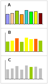
Suppose chart A displays population density by country. “Vary colors by point” is an option in Excel, but why should you use it? This is a design variation that confuses the reader and he’ll try to find a key for the color code (there is none, but he doesn’t know).
There may be some exceptions to this rule:
- When there is a strong association between color and entity, and that association is well known by the audience (for example, in sports);
- When there is a grouping variable (in chart B we are defining three groups);
- We want to emphasize a point (like in C, “my country”), although Kosslyn advises against it.
Another case of an spurious variation is discussed by Edward Tufte in The Visual Display of Quantitative Information:
The number of information-carrying (variable) dimensions depicted should not exceed the number of dimensions in the data.
 What does this mean? Well, this is something that you see in the media all the time and is very easy to understand through a visual example. On the left you see growth of monitor sales (this is mock-up data). Regarding height, the proportions are correct, but since you want to maintains the aspect ratio, there is also a variation in width. But because the object is perceived as a whole, our perception tells us that the sales growth is much higher than in reality was: growth rate between 2003 and 2006 is 150%, but the image for 2006 is six times bigger!
These two examples are grouped under the same principle but, while the first one is only confusing, the second one can be dangerously misleading, and that is one of the mortal sins of information visualization.