Dear Mr. Hervé Carré
I’ve been browsing through some of the Eurostat publications and I thought you would appreciate some constructive feedback, since it is your job to ensure that governments, businesses, media and the general public do have access in a timely manner to reliable and objective data. I’m starting with some general findings, then I’ll show and comment several examples and finally I’ll propose generic guidelines for data display.
First of all, a general strategy regarding how the data should be displayed seems to be lacking. I tried (without success) to find some kind of “style guide”. Of course there is the Interinstitutional style guide, where one can find gems such as:
Line drawings (graphs, diagrams, etc.), on the other hand, can be made more simply (without screens). Poorer-quality paper can be used (calendered or glazed) on which even simple drawings in Indian ink can be reproduced.
Indian ink?
The problem is, without a general strategy, format and content becomes heavily dependent on some random criteria, like the designer’s taste, skills and (numeric and graphic) literacy. What happens then? For similar data, there are very different approaches, depending on the publication or even from chapter to chapter. Also, what is overview, what is detail, how and when should they be used, are not always clear.
There are explicit guidelines to reduce printing costs by minimizing the number of colors. The publication design should accommodate that, but it doesn’t, and many charts become unreadable. If the designers don’t know how to work within these constraints, hire someone else.
Speaking of charts… Charts are not there just because. With a good chart, trends and patterns in the data are easily spotted and that really helps the reader to understand the data. That’s what they are used for. They are not there to poorly illustrate some numbers. I believe that a chart tells us a lot about its designer’s information management skills. The chart is just the tip of the iceberg.
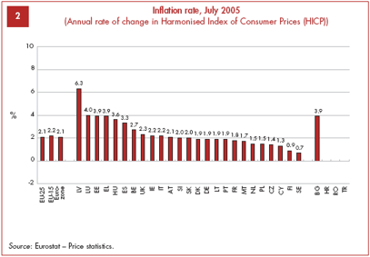
Let me show you several examples of badly designed charts. From The social situation in the European Union 2005-2006:
A chart is not a table. Only some “special” columns should be labeled (outliers, totals…). In this chart the column labels look like the march of the ants. If they are really needed, there are other options that should be considered (also, why does the scale in the Y axis starts at -2 when the minimum value is 0,7?).
This chart is particularly unreadable. It supposedly compares the mean age of women at birth of first child in the new EU members with the minimum and maximum values in the EU-15. This maximum/minimum corridor is a good idea, but the Min “EU-15” area should be white (to emphasize the corridor above). But no one can see meaningful trends in nine series.

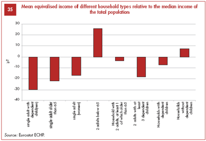
Column charts shouldn’t be used with such lengthly labels, no one will read them. Perhaps they should be replaced by icons.
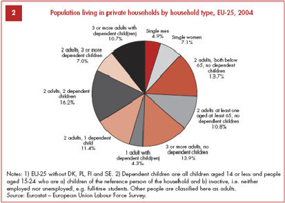
According to the general wisdom, pie charts shouldn’t be used; if they are used, five or six should be the maximum number of slices, and they should be ordered from maximum to minimum. How far from the general wisdom is this chart?
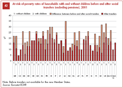
This is new to me: the chart not only has a legend for the series but also for the x axis.
From Consumers in Europe:
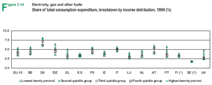
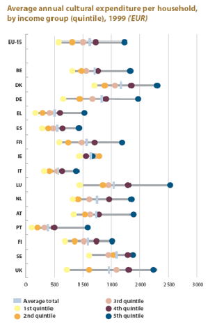
I am sorry, but this display of quintile groups (what?) is absurd. It doesn’t make sense, the markers completely overlap each other, the chart aspect ratio doesn’t help… This is absolutely useless.
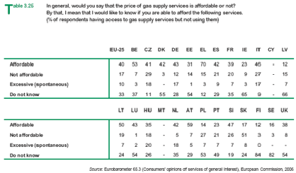
Avoid breaking a table in two. If you have to many columns, try to switch columns and rows (it could be done in this case).
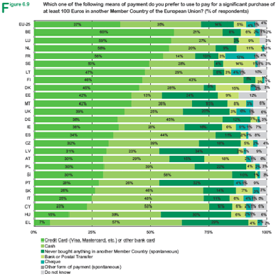
The march of the ants vs. the scattered army… Again, a chart is not a table. If you label everything, you don’t get the table and you lose the chart. Stacked bars should also be avoided.
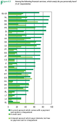
I understand that, by using a single color, you minimize printing costs. But what’s the use of a chart if you can’t read it because you can’t see where a series is? The human eye can spot very subtle color differences, but connecting the dots (or the bars) is a very different story. The chart design should ensure that the reader can discriminate the series.
From Europe in figures – Eurostat yearbook 2006-07:
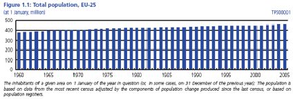
Is this relevant? Can’t we just say “EU population grew from 390 millions in 1960 to 460 in 2005”? What is the chart for? There is no change, there is no story, there is no chart.
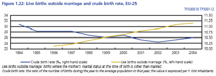
The lines here have to struggle to be seen. Grid lines are at the center of the stage, when they should only have a supporting role. Also, which series is the secondary Y axis linked to? How can we know?
From Cultural Statistics:
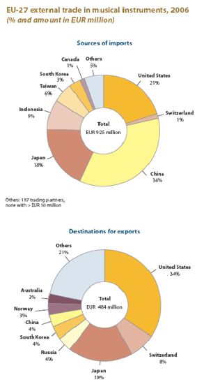
Comparing pies is dangerous. For example, a reader could conclude from these charts that there is a positive balance for the EU in the trade with the US (the imports slice is much smaller than the export slice). But 21% of 925 million (imports) is 194 million and 34% of 484 million (exports) is 165 million. In fact the imports are larger than the exports. The casual reader will have a different perception.
Quantiles again. Funnier, but what does it say? Where are the trends? Where are the patterns? And why is it sorted by country code? Why not by the average total?
This is not cherry picking, I’m afraid. A large majority of the charts in these Eurostat publications suffer from flawed design that prevents them from fulfilling their role. There are other problems besides bad chart design, but they can only be seen at the page or multi-page level.
So, how can this be improved? For starters, you should sponsor a new Eurostat style guide to ensure that a general strategy for information display is available, known and applied. Here is a small and random sample of guidelines that could be included:
- For each chapter in a publication, create a report with small tables and charts. Put the detail tables at the the end of the chapter;
- Use country names or country codes (preferably), but not both;
- Too many series render a chart unreadable – use panel charts instead;
- A chart is about variation, not about specific values – remove anything that masks or hides it;
- Reduce chart size;
Please note that I’m not a graphic designer. I am not trying to convince you that the Eurostat publications should have prettier, handmade, colorful charts and tables. What I am trying sell is this idea that a good information design not only dramatically improves communication effectiveness but can also have a positive impact in other areas, like reduced printing costs (for example, the number of pages of the Yearbook could be cut down by 20% without sacrificing content).
Still not convinced? I’ll tell you what. Select a chapter of the Yearbook and I’ll redesign it for you. For free. Then we’ll meet to discuss the results.
Thanks for your time and hope this was helpful.
Best regards,
Jorge Camoes
I would be very surprised if they take you up on your offer. I don’t think people who make bad charts realize how bad they are. Perhaps it’s like bad singers….
Yes, Jon, I would be surprised too. But, what about 20% reduction in printing costs? That would grab my attention…
Thanks for your comment on my comment. It would be interesting to know if you receive any answer from Eurostat.
Bernd
I’ll keep you posted…
Hello,
of course there will be a reply to Jorge’s comments (and Eurostat is just about to finish a style guide).
On the style guide issue: my personal opinion is that although style guides are necessary in public organisations, there is nevertheless a certain trade-off between such guides and creativity of authors. It is like the difference between a glossy commercial brochure (more beautiful but sometimes boring) and an individual creative product (sometimes more ugly but often more interesting and appropriate because the author remains free in his choices). Of course, clear mistakes regarding dissemination should be avoided.
Best regards,
Matthias
—-
The views expressed are those of the writer and may not in any circumstances be considered as stating an official position of the European Commission (Eurostat)… 😉
Hi Mattias
Thanks. I was very pleased by your comment and I’m glad to know that you’ll have a new style guide. Will it be publicly available?
If everyone shares a core set of values and skills probably a style guide is not needed and each publication could have its own “personality”.
I wrote this post exactly because I don’t see those sets of values and skills at work. I think the post is clear, but let me emphasize this: its not a matter of pretty vs. ugly charts. Its a matter of broken information displays. And they can’t be fixed by a graphic designer (I see this mistake too often).
While not intending to defend these Eurostat charts in general, isn’t the % stacked barchart a fairly efficient way of visualizing categorical distributions by country?
Sure, leave out the barely legible labels so it doesn’t look like a wargame in progress.
What would you recommend in place of the color coded % stacked barchart? (A table? Surely not pie charts!)