Context: why written instructions suck.
Data visualization is a young discipline, and we use a lot of words to discuss and try to figure out what works, why, and when. I do think experts could/should use more visuals in these exchanges, among them or when communicating with a general audience (to be honest, my own data visualization book would probably benefit from such advice.)
When I started this project, I wanted to focus on the how-to part, and the end product should be a dry step-by-step guide on how to make charts in Excel. But, because I was using words, leaving the why and the what-for parts out was harder than expected. Words have a will of their own, and they multiply like rabbits if you’re not paying attention. Having to weed them out when you’re not even using your mother tongue can be exhausting. And then one day I realized I could get rid of them, all of them. “Wordless” became my favorite word.
We need words to explain or justify, but written instructions can range from confusing to useless (can you imagine written instructions in aircraft safety cards or traffic signs?) Even if they require some learning, visuals tend to be more universal and immediate.
There is another good reason to go wordless. Most people can communicate in English, but it doesn’t mean they are comfortable with it to fully understand an argument or even to follow instructions. Living in a small, poor, and non-English speaking country (Portugal), I’m keenly aware of this. Small countries also mean small or non-existent markets, especially for niche products. There are no translated data visualization books here, and only one book was published by a local author (in 2006!).
Going wordless, IKEA style
A few years ago, I realized that I tend to gravitate towards a low-cost, ephemeral, and functional type of data visualization or, in other words, IKEA-style data visualization (I suspect most people wouldn’t take this as a compliment, but I would). This project made me aware that there is more to learn from IKEA.
For many of us, assembling a bed or a table is a complex task. That’s why simple and clear instructions are essential for the success of a knock-down furniture business. IKEA’s wordless instructions manuals send a unified message than can be understood by most people across cultures and languages (easier said than done, though).
If you can assemble a BILLY bookcase, I’m sure you can use wordless instructions to make a chart in Excel.
The sign system
We can agree that aircraft safety cards and IKEA instructions display a real-world situation that is easily recognizable, while many traffic signs are abstract and you have to learn what they mean. We’ll use this one as our model.
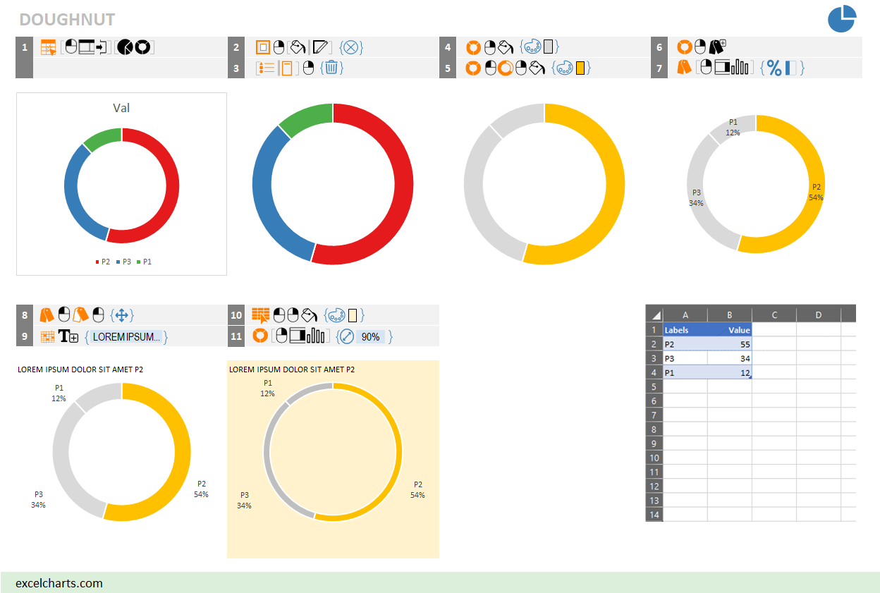
The image below provides instructions on how to make a doughnut chart. If you follow the steps you should get a similar chart. Create a small table like the example displayed and try it out!

In general, to make a chart you need to select an object, perform some kind of action and apply formatting options. Colors identify each category.
Try to read these instructions. For example, step 2 means “select the chart area and do not apply Fill or Line”. Step 7 means “select the labels and display percentage and category name”.
I tried to use self-explanatory icons whenever possible, but their meaning is also available in multiple languages. The ebook comes with English, Portuguese, French and Spanish translations, but more can be added to a table in a shared Google sheet (the file is open access and unprotected, so anyone can add a new language).

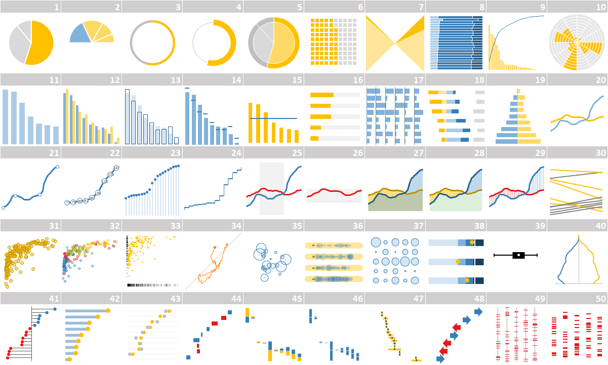
There are few simple charts that most people can make without instructions. Think of them as training wheels the will help you familiarize with the icons and their meaning. This is a first set of 50 charts (hopefully there will be more soon!), so no chart is particularly complex.

Where to go from here?
By design, this ebook focus on the how-to, and excludes explicit data visualization guidelines. But the examples stay clear from Excel chart defaults and formatting options. There are a few minor concessions, but no capital sin. I like to expose readers to these implicit guidelines while using the instructions.
This is my first attempt to create a sign system, so a few inconsistencies remain. I’d like to iron them out, optimize the design and automate a few steps. I’m curious about using these visual instructions to create more complex charts or evaluate their flexibility when applied to other point-and-click tools.
Buy the ebook!
You can buy the ebook here.
Very good