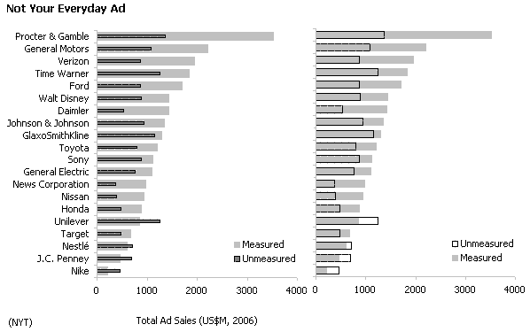
This chart [fusion_builder_container hundred_percent=”yes” overflow=”visible”][fusion_builder_row][fusion_builder_column type=”1_1″ background_position=”left top” background_color=”” border_size=”” border_color=”” border_style=”solid” spacing=”yes” background_image=”” background_repeat=”no-repeat” padding=”” margin_top=”0px” margin_bottom=”0px” class=”” id=”” animation_type=”” animation_speed=”0.3″ animation_direction=”left” hide_on_mobile=”no” center_content=”no” min_height=”none”][via Junk Charts] in the New York Times uses a “tornado” chart (a population pyramid-like chart) to display two series, advertising spending in measured (traditional media) and unmeasured (Internet…) channels.
When discussing how to create population pyramids, I wrote that I don’t really like tornado charts, specially if you only have two series, because it takes up too much space and you can’t compare each entity (age group or, in the example below, corporations).
I would select a bar chart with overlapping series, like the examples below:
Both clearly show the ranking by measured channels and the proportion of advertising spending in the unmeasured channels. Also, it is a safe format for the target audience.
The role of the sorting key
The original chart sorts corporations by advertising spending in the unmeasured channels. The sorting key depends on what you want to say, but you should play with the different options before selecting the final solution. As a rule of thumb, a bar chart should be sorted by the series with larger values and/or the highest variability. Sorting this chart by measured channels one can easily spot the higher proportion of spending in the unmeasured channels at the bottom. If “graphical excellence is that which gives to the viewer the greatest number of ideas” (Tufte), then in this case you should select the “measured” series as the sorting key.
Take away messages:
- Know your audience and select a design with those readers in mind;
- Be sure that the reader can easily compare what you want him to compare;
- If the overall shape of your chart depends on a sorting key, try several options and select the one that shows the most interesting patterns;
- Don’t be afraid of repeating the same chart with different sorting keys (don’t overdo): each one has a unique view on your data;
[Update: you don’t need to repeat the same chart with different sorting keys if you can interact with it, like in the basic spreadsheet I used for these charts. I added also a small stacked bar to display proportions.][/fusion_builder_column][/fusion_builder_row][/fusion_builder_container]

What about the part where they break down the measured side into three more categories (Print, TV and Other)?
I definitely agree that the overlapping bar chart makes it easier to compare measured vs. unmeasured.
Another option would be to just show the difference in a verticle bar chart where zero is set in the middle of the chart and negative is to the left and positive to the right. The difference being you combine the two values and just plot a single point.
Tony
Not only the break down is difficult to compare but also there is no point in showing it. I would use a second chart, if needed.