Regular readers know that English is not my mother language , but are kind enough to forgive me for my many mistakes.
I am always willing to learn. Today, while researching for an upcoming post, I came across an expression I never heard before: “spiffy charts”. I felt in love with “spiffy charts” the moment I read it. And I read it straight from the horse’s mouth (I mean Microsoft).
If you don’t know how to make a chart and are keen to preserve that blissful ignorance, I highly recommend Microsoft Office Online Training, specially the module Create a professional looking chart (regular readers also know how I love “professional-looking charts“). You’ll learn how to “customize your charts to make them more attractive, memorable, and effective“. This means useless charts.
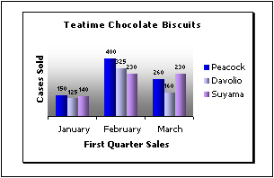
So, let’s see how to turn a humdrum (this is a new word, too…) chart into a spiffy one. First, to declutter your chart remove grid lines:

As you know, grid lines are useless, specially if you don’t care about the data. I would remove the gray background and the border around the legend. And I’d give the chart a more descriptive title to tell the users what they are seeing, but that’s my personal taste.
Then you should remove the y-axis and add labels to each column, further “decluttering” the chart. At this point the readers start sighing for a nicely designed chart table.

Want to give your chart a little more “flair” and make them more “professional-looking”? Just add a gradient fill and a subtle shadow:

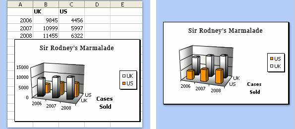
Now comes the spiffy part. Imagine that you have a 3D column chart with two series, and one obscures the other. What do you do? No, you can’t remove the stupid 3D effect (remember: you want to make t spiffy chart, not a humdrum one). Well, all you have to do is to change the order of the series:

Much better now, don’t you think? They accept that 3D charts “can be more attractive, but sometimes more difficult to read accurately” (surprise, surprise!). Apparently that’s a detail in the grand scheme of things. You are excused from making accurate charts if you are making professional-looking ones.
So, what else can you do to improve your chart? Ah, yes: the y-axis in a humdrum column chart always starts at zero. We don’t want that, do we?

Now you know how to make inaccurate, professional-looking, spiffy-with-a-flair marmalade charts. Please go straight to the kitchen, make some real marmalade and forget all you’ve learned about data visualization in the Microsoft Office Online Training.
(This is not a real Microsoft Office Training site, is it? It must be some kind of spoof site, and I fell for that trick. Right? Right?)
Sigh…
🙂 Great post!
Please don’t make the mistake of confusing the wonderful word “spiffy” with the dreaded “professional-looking” – this is Microsoft’s error and should not be compounded. Reclaim spiffy for the truly great!
Wow, that’s pathetic. Unfortunately it is not a spoof. It is too bad that Microsoft abuses its authority and puts out such stupid suggestions.
I agree with Jon – what an obvious abuse of their “power”. They should stick to formulas and leave the data visualization techniques to those that know what they are talking about.
On a more positive note, at least they got a few things right. Well, actually only two – removing the grid lines and deleting the border from the legend. Although, I actually prefer the legend to be at the top/bottom versus the side so you can maximize the actual chart width.
Tony – I think Jorge was joking when he said “grid lines are useless”.
As for the legend, there are at least two improvements that you can make.
First, put the legend INSIDE the chart. This makes it simpler to cross reference between information and key, AND it maximises the space available for the chart.
Second, don’t have a legend at all ! Just label some of your data directly.
Jorge – good find!
Gerald – seldom do we see sensible guidelines for how to handle the legend. For low information density charts like these, yes, the traditional outside legend seems superfluous. However, for higher information density charts (old-style “professional charts”), William S. Cleveland had a rule “Do not clutter the interior of the scale-line rectangle.” In The Elements of Graphing Data, while fully opposing ChartJunk just as Tufte does, he offered some reasonable arguments for preserving that rectangle formed by four scale lines (not two) — to make it clear where the data points may be found, and make them less likely to be overlooked.
DaleW – I would agree that for higher information density charts, putting the legend inside the chart would be bad. But for the charts illustrated – which have extremely low information density – finding a good place to put the legend inside the chart should be easy. In Excel, external legends usually just take up too much space, space that could have been given over to making the data elements larger and easier to understand.
More generally, this article prompts the question – If Microsoft have given us an example of what NOT to do with charts, what SHOULD we do with charts instead ?
Here’s the list of things that I would typically go through when making an Excel bar chart like this. Some of these may not be right for all applications, but I do find myself relying on them most of the time. And of course you can set these up as a customised chart in your library once you’ve decided your preferences.
In no particular order (and using Excel 2003) . . .
1) format plot area to white, light grey border
2) format gridlines to light grey
3) format both axes to light grey
4) remove tick marks from both axes
5) make sure scale is appropriate, and also major units (don’t use minor units)
6) set appropriate number format for Y axis (and X axis if required)
7) format each data series to NO border, and choose an appropriate fill colour
8) format legend to no border, and if possible place within the chart
9) make the chart as big as possible, to take up all the available space. By this I don’t mean the chart HAS to take up the entire screen. If you want to have 4 or 10 or 50 charts on the page, that’s fine, but make sure each one takes up 100% of the space you have allocated to it.
10) make the plot area as big as possible
11) select an appropriate font size for all text elements
12) if possible, do without x and y axis titles – try and make the titles self evident from the chart title, the Y axis number format, and the X axis category names.
I’m sure many will disagree with some of this – over to you 🙂
Why have you started from the position that a graph is better than a table? A well designed table can often communicate numeric ideas more quickly and accurately than any graph.
Hi Sally, thanks for stopping by. That’s how it sounds? I didn’t mean that. I just wanted to emphasize that if you start to labeling every single data point probably you need a table, not a chart. “The medium is the message”, right? That’s why a bar chart cannot replace a pie chart and a table cannot replace a chart. Different messages/media answer different questions.
Gerald – I like your starting point for a classic Excel bar chart much better than what Microsoft gave us! Still, ok, I might quibble with a few of your recommendations:
4-5) The default tick marks on minor units have their uses. If we have an axis label (and maybe light gridlines) every 2 units, tick marks for the odd (minor) units feels right to me.
7) Topless (and sideless) bars seem purely a matter or personal preference.
8) Possible does not always equate to preferable, but ,*agreed*, most bar charts don’t need a legend kept outside the data rectangle.
10-11) Indeed, the main factor preventing the plot area from swallowing the whole graph space is the need for easily legible & understood titles & axis labeling…
12) [Now Jorge’s going to have to jump in to keep us from fighting!] One of my pet peeves is charts made by people who can’t be bothered to label their axes clearly, or put units of measure on them. The axis labels are the ideal places for those little details, like perhaps an apparent Yugo sales boom chart actually showing total units shipped either way (not $ revenue) only in 1981 in Eastern Europe, which would not constitute a current world threat to Toyota net revenue after all.