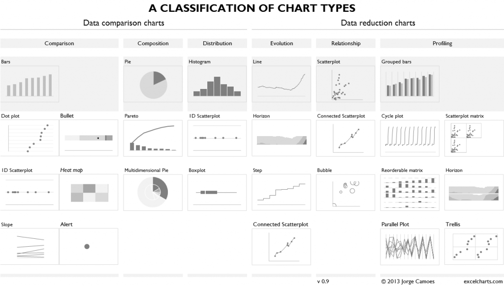
A few weeks ago, I needed a classification of chart types for my book, and reinventing the wheel was the last thing I wanted to do. I started with Andrew’s classification and the Juice Analytics version. It’s a good starting point, but I couldn’t fit it into my work, so I decided to design my own classification (it’s always nice to have new standards), inspired by this one but also by others, like S. Few’s Chart Tamer. And no, I was not going to design a new periodic table of data visualization methods.
Here is the idea: a chart can (a) help you compare data points faster but keeps each data point as the basic information unit or (b) help you generalize the data and find patterns, making the data points less relevant. These roles should be as mutually exclusive as possible (but in real world that’s harder than expected).
There are six types of questions, three of them involving data comparison and the other three data reduction. The questions are:
- Comparison: comparing and sorting data points;
- Composition: part-to-whole comparisons;
- Distribution: comparison of data points along an axis;
- Relationship: relationship patterns between two or more variables;
- Evolution: time patterns;
- Profiling: pattern comparison.
Notes:
- The first row lists the most commonly used chart in the category (it’s a fact, not something I agree with);
- Only charts that can be made in Excel are included;
- Depending on the question and the task, a chart type can be found in more than one category;
- You may find it bizarre to list a dot as a chart type, but one/off dots are critical in some tasks (monitoring) so I though they deserved to be included;
- There are no neutral and objective taxonomies.
Please share your comments and suggestions below.
(click to enlarge)

Missing build-up/waterfall charts… maybe they fall into the step category, but I’d rather consider them a single chart type, with its usefulness and inherent problems.
Hi, what about a treemap as a composition category? There is the old Microsoft Research plug-in that makes treemaps possible in Excel:)
Johanna: Treemaps are missing because you can’t make them in Excel without the plugin. There is a chart that I really like, the trilinear plot, that should be here also, but it’s not easily made in Excel (but it can be made without a plugin).
I would add Bars to composition and possibly evolution. I’d also consider illustrating horizontal bars in the space you have next to the vertical bars, top left and top right. Stacked bars seems like a separate chart type that should go under composition too.
Joey: thanks for your suggestions. Adding horizontal bars is a good idea. Stacked bars will never be added to this classification. That’s what the Reorderable matrix is use for (one of its uses). There must be a time pattern in the the evolution category, that’s why bars can’t be there.
As I said, no classification is neutral…
Great article. One more similar chart types classification I have used before..http://flowingdata.com/2009/01/15/flow-chart-shows-you-what-chart-to-use/
Paras: that was my starting point (see the link above to “Andrew’s classification”).
Sorry about that. Andrew’s site is blocked at work (maybe word “extreme” is blocking it) so couldn’t open.
Nice to see also others try to structure visualization types, especially when using Excel.
I have a few suggestions:
* We shouldn’t talk about pie and multi-pie charts. Yes the software provides and yes, people use it, but there are much better ways to visualize data.
* I would not use an horizontal chart for showing comparisons, distributions and profiles. Only time (evolution) should be visualized horizontal. Everything else is a vertical structure. I know, sometime people say, a horizontal chart fit better, regarding the layout. But from the readers view, it really helps to use horizontal only for time.
* I also miss waterfall/bridge charts. They can easily done with excel. And I also miss an extra category for variance charts.
* It think, an alert is not a chart. It’s a color dot and everybody is asking “why” when seeing a red one. So i never would use them without an additional chart as explanation.
* Slopes and parallel plots. Some call them spaghetti charts. I prefer to separate 10 line to 5 or 10 small charts. Equal scaled and layout in a way everybody can easy compare all the line. Then labels can be added and you have much more information. Btw: Labeling is a big issue und I would say, without labels charts are only worth 50%.
* I didn’t understand the two categories “Data comparison chart” and “Data reduction chart”. Especially the grouped bars compare thing and do not reduce anything.
* Why is a tree map not doable with excel? Here is a starting point: http://www.hichert.com/consulting/schaubilder/453#029
* A general point when talking about charting, yu should always mention the scaling issue. Watching more the one chart with the same unit but without labels and not equal scales the worthless. You can’t compare them and they tell you the wrong story.
As you are from Portugal, maybe you already heard about IBCS International Business Communication Standards http://www.ibcs.a.org. The have a very consistently visualization/charting concept. A lot of companies in Austria, Switzerland, Germany, … adapted it and also tools are already available (SAP, Excel, Qliktech …).
We develop an mobile app which is also based on that concept. It’s called DENSiO http://dens.io
A preview is available at http://is.gd/densio.
May that helps structured the charts. I would start thinking about what I have (Scenarios, Measures, Hierarchies) then ask what I am focused on (evolution, variance, comparison, composition) and select the proper visualization afterwards.
Joerg