Why do people insist on using “professional looking charts” in their presentations? If I wanted to divert the audience’s attention from the data, I would get a professional clown suit, instead. I would look professional. Not exactly the professional-looking presenter people expect in a corporate environment, but nevertheless a professional.
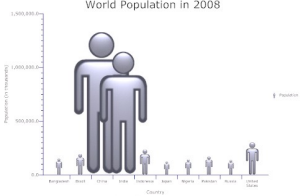
Meet professional-looking Mr. and Mrs. Gulliver and their Lilliputian friends (courtesy from SmartDraw):

(This may be a pet peeve of mine, but whenever I hear the expression “professional-looking charts” I reach for my Browning.)

Jorge –
Is that red dot your clown nose? Or a pie chart showing the proportion of bad “professional-looking” charts.
Jon, a large majority of pie charts is nothing more than a clown nose, so it is difficult to tell them apart…
I think this kind of chart speaks down to people… not much of a challenge to understand.
Speaking as a SmartDraw employee and as someone with a background in hard science, charts like these are best used for quickly illustrating relative values. If I wanted to quickly demonstrate that China and India have substantially larger populations than the United States, this is an effective means of doing so, albeit a cutesy one. The important data on this chart isn’t the specific population quantities – it’s the relative differences between them.
This chart does a sufficient job getting that point across. If I wanted people to walk away knowing the exact population figures, something I know to be impossible using PowerPoint, I would give them a printed hand out with a data table.
Does this “divert” the audience’s attention away from the data (relative size of population?) I don’t think so. It might not follow the, in my opinion, impractical aesthetics of Edward Tufte, but it’s certainly a far cry away from wearing a clown suit.
Jorge –
It’s not only changing in two dimensions. The larger androids are clearer (better focused), have darker fills, and have bolder, darker outlines. This gives them additional emphasis over and above the height and width.
I have a post coming with a more specific discussion of this particular chart.
@ Aaron: Thanks for your comment. Problem is, proportions are wrong when you change two dimensions with a single variable. Robert Kosara wrote about this a while back. In this case it is not a matter of following Tufte’s aesthetic principles. It is a matter of not distorting the data.
@Jorge,
Ah, I see what you’re getting at. I played around with the example a bit and I see what you mean. Yes, I agree that’s a problem – I kicked this over to the product developers so they can look into it.
One thing they can do, and have done in some of the examples, is simply stack the stick figures on top of each other instead of scaling one figure.
Headless androids are less dangerous than giant ones 😉
If you have any additional feedback regarding SmartDraw you can email me using the address I supplied in the comment field. Thanks for putting together a good blog.
@ Aaron: that will create some nice headless androids… Thanks for listening and please note Jon’s comment.
The vertical axis is clear with the figures, but I thought Americans were fatter than people in other countries. The horizontal dimension of the figures suggests otherwise, or is that China and India expect to be invading the countries next to them on the horizontal scale? I thought the US was best at extra-territorial adventures, but this graph presents things in a different light.
I see the point of the post, but I think it fails to credit the one-dimensional side of the picture. If I draw a column chart with two observations, say, the numbers 1 and 2, the second column will be twice as big.
If I am talking about money (say American GDP vs Bolivian GDP), I might just as well use money bags to represent these GDPs (just like the Playmobils above). The point of the money bags is to dramatize a picture.
I think that the problem arises when people intentionally use such charts to lead people into thinking something that does not exist. I mean, my new money bag may be twice as tall and twice as wide, but I am not saying or suggesting it is now four times bigger than before. I want the person to quickly see that there is a difference… in a dramatic way.
The impact will be different.