Hans Rosling was here in Lisbon today, for one of his remarkable presentations. It seems that almost no one in the room new about his TED talks and, of course, everyone loved his charts. He gave his presentation in Portuguese, so some extra points there too…
If you just return to planet Earth and don’t know who Hans Rosling is let me briefly discuss his role in the information visualization field.
Professor Hans Rosling became well-known around three year ago because of his remarkable presentation at TED (you can find it here). He was invited again next year and in his new presentation his slogan “seemingly impossible is possible” is defined in a memorable ending (you must see for yourself).
Rosling co-founded Gapminder, “a non-profit venture promoting sustainable global development and achievement of the United Nations Millennium Development Goals by increased use and understanding of statistics and other information about social, economic and environmental development at local, national and global levels” (from the About page).
Gapminder developed Trendalyzer, a charting tool that basically shows a time series in an animated bubble chart. Audiences love that, and with Rosling describing what is happening it is a quite impressive experience.
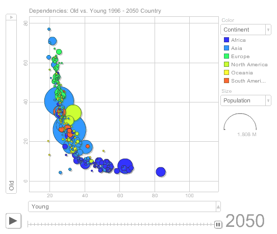
After the TED presentations Google acquired Trendalyzer and a striped down version can be used in the Google spreadsheet. A while back I used it to display population trends. Click on the image belowto open the chart.
Dollar Street: Life Behind Statistics
Another interesting application created by Gapminder is Dollar Street (you can download it here). We often are unaware of reality hidden behind statistics. For example, how do people live with less than a dollar a day? In Dollar Street, you can select a house (an income level) and you can see photo-panoramas of each room in the household. There is a talk at Google TechTalks by Rosling’s son, Ola, where he presents [fusion_builder_container hundred_percent=”yes” overflow=”visible”][fusion_builder_row][fusion_builder_column type=”1_1″ background_position=”left top” background_color=”” border_size=”” border_color=”” border_style=”solid” spacing=”yes” background_image=”” background_repeat=”no-repeat” padding=”” margin_top=”0px” margin_bottom=”0px” class=”” id=”” animation_type=”” animation_speed=”0.3″ animation_direction=”left” hide_on_mobile=”no” center_content=”no” min_height=”none”][Update: video no longer available; replaced].
Hans Rosling and Al Gore
It is interesting to note that, while Hans Rosling became famous because of his TED presentations using a new charting tool, Al Gore was awarded the Nobel Peace Prize. Both men use visuals extensively to raise awareness on issues like poverty and global warming. Al Gore uses a presentation software (Keynote) and his presentations were designed by Duarte. You can see Al Gore at TED here.
Hans Rosling and Business Visualization
Several of my co-workers wanted to discuss with me the use of Trendalyzer-like charts in their presentations. Trendalyzer creates very eye-catching charts, so that’s understandable.
I had to explain that, while these displays are much better than the usual Powerpoint presentations, they need a fairly long time series and and there must be some kind of global trend. Wasting time looking at bubbles jumping up and down is not exactly my idea of fun (or work). And they will become boring.
More important than that: must organizations don’t really know what information visualization is about. They don’t know how to use charts to find actionable patterns in the data. They don’t know how to use charts to communicate those patterns. They are handcuffed to the 3D flying and exploded pie chart paradigm. Replacing that paradigm needs a clear assessment of corporate needs, a long term commitment, a definition of best practices and, obviously, some training. In the absence of these, animated bubbles are just a new fad.[/fusion_builder_column][/fusion_builder_row][/fusion_builder_container]