After creating wordless instructions for making charts in Excel, here is the Tableau version. This post discusses similarities and differences between both tools. Check out the e-books at the bottom!
How to make a chart
To make a chart, you must select the data, encode the data into visual objects, format those objects, and add text (title, labels, annotations). When using point-and-click applications these tasks are essentially visual: select from menu items, click, drag and drop icons. So, when writing instructions for making charts using these tools, there is no reason not to use a visual language. If it works for traffic rules or IKEA’s assembly instructions, surely it can handle making charts! Also, using wordless instructions means that we can break much of the language barrier (potentially reaching a much wider audience), and unify instructions (to some extent) across tools.
My first wordless instructions experiment: Excel
In my previous post, I show that it’s possible to create wordless visual instructions to help making charts in Excel. I defined a structure shared across instructions pages: one chart per page, and up to eight cards per chart displaying intermediate steps. The data set (or a sample) is also displayed, as well as the formulas for calculated fields. The example below shows how to make a doughnut chart.

I’m not assuming these instructions can be read as easily as a plain English sentence. Many icons are self-explanatory, the meaning of others can be derived from context and some others must be learned. This handy multi-language dictionary (in English, Portuguese, French, and Spanish) can help you with that.
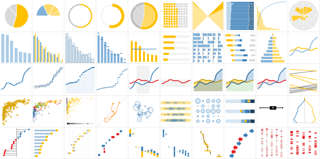
These instructions are not limited to making basic charts. Some of the 50 charts below are fairly complex for Excel, and they can all be made following wordless instructions.

Going further: wordless instructions for Tableau
I’m very familiar with Excel, so understanding these instructions isn’t hard for me, but it was encouraging to see how easily my test subjects (my 13yo kids) were able to follow them as well. Having somewhat proven that creating visual instructions can be done for a tool like Excel, the next question was: can it be done for other tools? So, I tested the same idea with Tableau.
Tableau is a different environment (understatement of the year?). A fundamental difference is that Tableau is a structured environment where you assign data to visual marks, instead of choosing a chart type from a chart library to display data scattered all over the sheet. If you’re coming from Excel, you’ll need some time to adjust.
I followed a similar set of constraints: one chart per page, cards to display the intermediate steps, the data set added to one of them. “Shelves” are an interesting concept in Tableau that you can’t find in Excel: they allow you to see the underlying structure and let you move things around by dragging and dropping, or using other visual marks. It made sense to include them, so for Tableau there are fewer and wider cards per page, to accommodate both the chart and the shelves.
I had no intention of forcing compatibility between the instructions for both tools. When possible, I used the same icons with similar meanings, but above else I wanted to respect the differences between the tools (more on this later.) Here is how to make a dot plot in Tableau.

Results
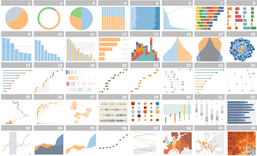
Since I already had instructions for making many charts in Excel, it made sense recreating them in Tableau by selecting a chart, and adapt the instructions for Tableau. I wanted to use this as a learning exercise, since my previous experience with the tool was limited. I got stuck plenty of times (often because I was thinking as an Excel user). But the Tableau community is really amazing, and I was able to find the right answers most of the time.

Now, if you are familiar with Tableau, and took a moment to think about the original list, you know how silly this idea of replicating the charts was. Some charts are simple variations in Tableau (change an option), but require a lot of work in Excel. The step chart is a good example: in Tableau, you change an option to switch between a regular line chart and a step chart, while in Excel you have to start from scratch and play with error bars to get the same result.
While some charts are simple to make in Tableau, circular charts tend to be harder: as far as I know, you can’t rotate a pie chart to start at a desired angle, for example. And then there are the error bars. How I missed them! I don’t often use them to show, well, errors, but I use them in Excel for everything else, from fake bar charts to fake grid lines, to fake sticks in a lollipop chart. You can imagine how flabbergasted I was when I discovered that Tableau users have been living all these years without true error bars!
Tableau vs. Excel
I don’t want to turn this into another Tableau vs. Excel post, but this exercise made a few things clearer to me:
- If your needs are simple and you can/want to stick to the Excel chart library I don’t see much benefits from switching to Tableau.
- Except for circular charts, many of the more advanced Excel charts felt pretty basic when made in Tableau (I hated that feeling!).
- For similar charts, you need to take more micro steps in Excel than in Tableau.
- In Excel, my kingdom for
a horsesmall multiples. - Encoding data into variables (color, size…) is way easier in Tableau.
- Combining multiple marks is easier and more flexible in Excel than in Tableau.
- That comes at a price: in Excel, all those steps need to be recreated to change perspective, while exploring and moving things around is at the heart of Tableau.
What’s next?
Compared to Excel, I believe the instructions for Tableau are more consistent and use a few new ideas. This needs to be cared first. My ultimate goal is to have a generic visual language that can be applied to any point-and-click tool. I’m still unsure if this is feasible, but it’s my reference point. Using both Excel and Tableau gave me the opportunity to compare in more detail the process of making charts. However, using then raised a number of challenging questions:
- Is it really possible to unify them into a single set of icons and grammar rules?
- How much of it is tool-specific?
- What’s the right balance between more abstract, tool-agnostic icons, and concrete, easier to recognize icons that tend to be associated with a single tool?
- How much of this can be automated?
- How easy is to adapt it to other tools?
So, next steps: improve compatibility between instructions for both tools and make more complex charts, especially in Tableau.
The e-books
Do you want to learn how to make the charts above? Do you think these visual instructions can help you? You can get the Excel or the Tableau e-book for USD $27 each, or a bundle for only USD $37. With your purchase you get access to any updates until the end of 2019.