How do Excel and Tableau compare when actually making a chart? I couldn’t find such post, so I wrote one. I’ll create a simple chart, a population pyramid, and comment on the process. To make it a bit more interesting, we’ll compare a certain population in 1986 with the estimates for 2050.
The Data
Let’s start with the data. Most tools draw a clear distinction between data sources and data display. In Excel, this distinction is often blurred because users don’t follow basic best practices. This is the first of several (more than seven, I’m sure) deadly sins Excel users often commit: badly structured data.
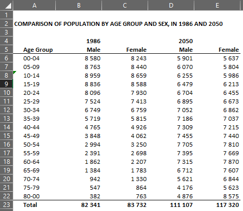
There is nothing terribly wrong about the table above. But it is designed to display data, so it should never be used as a data source for making charts, because it will severely limit your freedom to explore the data, and increases update and maintenance costs. This is the first case of badly structured data.
Also, Excel allows you to enter the data wherever you want in a spreadsheet, or even in multiple spreadsheets. If you know what you are doing, that can be immensely useful. If you don’t, you’re going to find yourself in some form of spreadsheet hell.

In Tableau, the distinction between a) data sources, and b) the objects (display tables, charts) that use them is clear. Also, Tableau is a lot less forgiving when it comes to data structures.
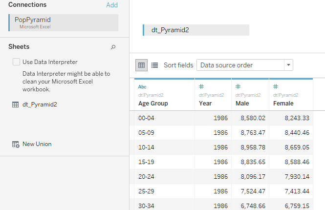
Let’s get back to the first table. To add more data you’ll probably add more columns, and you’ll have to recreate the charts, adding the individual data series. In Tableau, the table structure (number of columns) will not change, which makes data exploration much easier. (This is not Tableau specific: you can, and should, use this table structure in Excel.)
Contrary to a popular believe among Excel users, this is not a detail. The flexibility you love in Excel sooner or later will turn against you, while hard-to-read tables will prove very flexible when exploring the data. Try to add multiple years and regions to the first table and watch how quickly it gets out of hand.
Encoding in Tableau
Encoding means that you associate a data point with a visual object (a bar, for example) and one or more of its properties (height). Because you do that for all data points in a field / series, you can compare bar heights, which is much easier than comparing the actual values in the table.
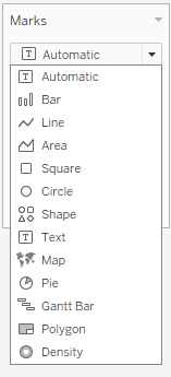
In Tableau, these visual objects are called marks. You let Tableau select a mark for you (depending how you structure your chart) or, preferably, you select the mark yourself.
Think of marks as words: even if they are similar they don’t mean exactly the same. Choosing different words will change your message and make it more or less effective. For the same data, bars will focus attention on pairwise comparisons, while lines will emphasize the overall pattern. This is an editorial choice, not something you should let the computer decide.
Now, suppose you decide (wisely) that bars are not the right mark/chart type, because change between 1986 and 2050 is not clear. Perhaps lines are better, or areas, or… In Tableau, since you already have a structure, you simply switch marks until you find one that feels right.
Now that you selected a mark, the next step is to assign data to some of its properties. You do that by dragging fields into “shelves”, at the top and on the left (I’m oversimplifying).
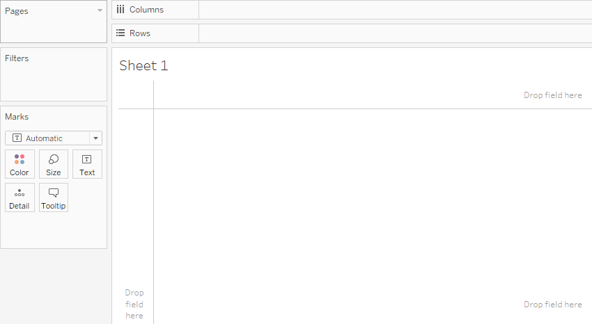
The most important property is Position (along the x and the y axes). That’s what the shelves at the top are used for. Other properties, like color or size, are available on the left. Here is how the total population profile looks like in 1986:
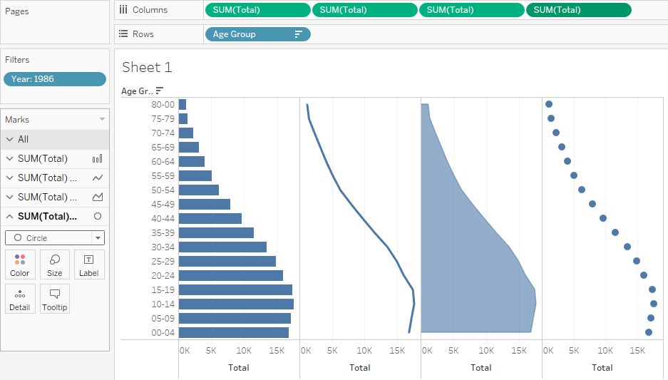
So, for each data point you have two coordinates: a quantitative one (total population) varying along the x-axis (“Columns”), and a categorical coordinate (age group) varying along the y-axis (“Rows”)
Encoding in Excel
In Excel, things are more complex. First, it uses this outdated concept of “chart types”. They are OK for a casual conversation but not for such a massive tool like Excel.
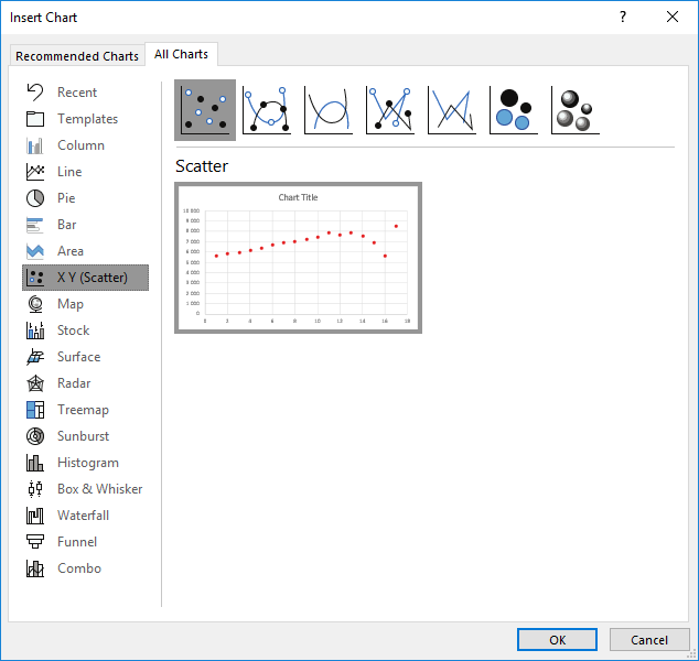
The Excel charts library is a mess of visual objects and properties. What’s the point of having columns and bars, each with the same sub-types, when “Direction” could be defined as a property? This window is the Excel equivalent of Tableau shelves (never consciously realized Excel uses the concept of “Legend Entries” for series):
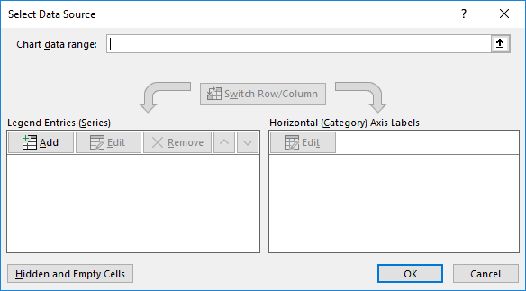
Because of this mess, when you click Add, you get one of three different windows, depending on the chart type: the X-Y window, for scatter plots, the X-Y-Size window, for bubble charts, and a third version for all the rest (I think):

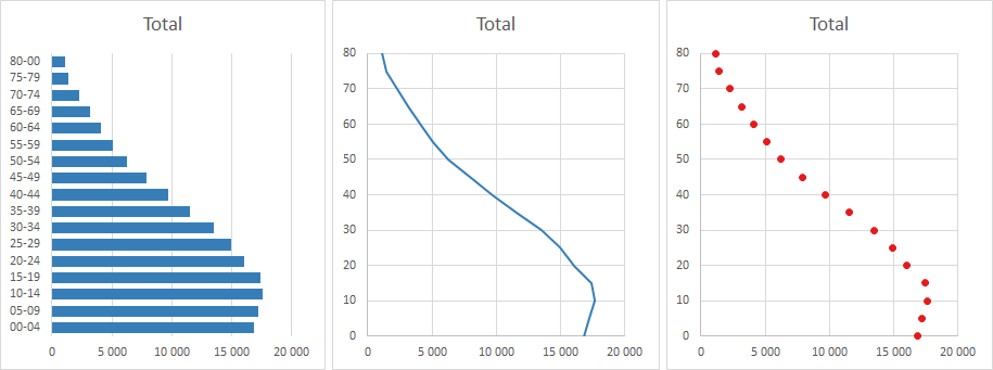
Because Excel uses these “special cases” (and not a generic X-Y structure), it’s easy to find examples that don’t fit them. For example, there is no concept of vertical area chart. If you want to make a vertical line chart, sorry, but that’s also not possible, unless you use a connected scatter plot. But, because the y-axis needs to be numeric, in our case we must transform the age groups into a quantitative scale. We can do that by taking the lower limit of each age group (0, 5, 10…). Note that, while I was able to add copies of the same data to the top shelf in Tableau, in Excel the charts are independent of each other:
Design Data
Design data are data you add to your chart to help you achieve certain visual effects, improving the display of the real data. A good example of display data is jittering, whereby you add a small amount of random data to minimize point overlap.
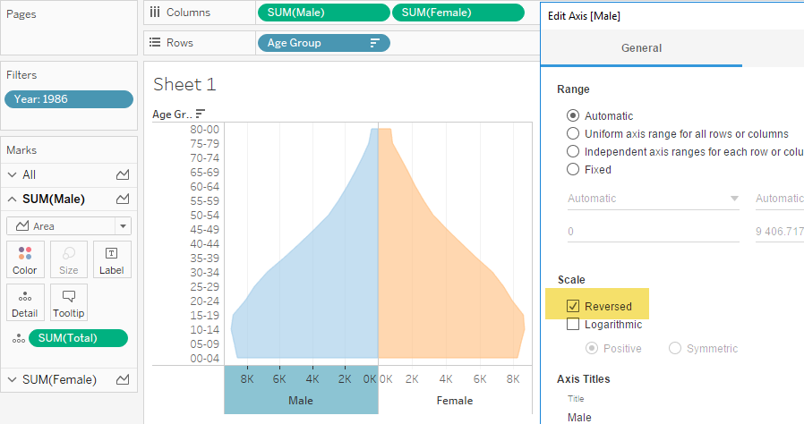
I don’t like the traditional design of a population pyramid. Both sexes should be displayed to the right side of the y-axis, not male to the left and female to the right. It would be easier to compare them without breaking the axis logic (there is a positive and a negative side). But let’s assume it’s OK to display the series Male to the left side of the axis. How do you do that in Excel? I wanted to use two axis and reverse one of them and align them at the origin. So far, no luck. The alternative is to use a stacked bar with a fake first series that must remain hidden. The second option is to multiply the data for -1. Obviously you have to take care of the scale, because it is wrong in both of these charts. I did that in the third example below.

In Tableau, you don’t have to mess with the data. You simply select the series and reverse the scale:
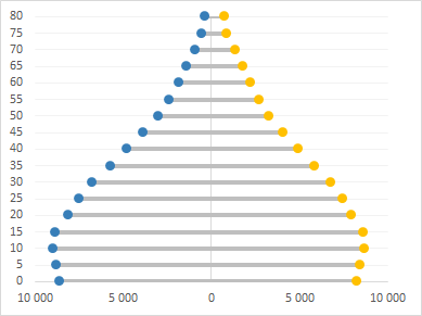
Let’s see an example a bit more complex. Suppose you want your population pyramids to take the form of a lollipop plot (I’m not saying it’s a good idea). In Excel, you simply add error bars to a scatter plot:
In Tableau, you add each series twice, use the bar and circle marks and, very important, you need to set each horizontal scale to Dual Axis and Synchronize them. The result is similar.
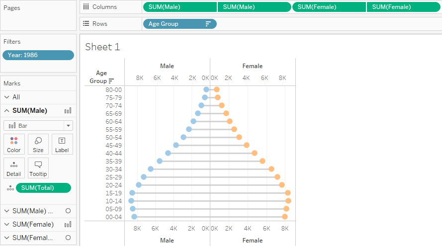
The Dual Axis seems to be the most widely used technique to create visual effects in Tableau. Combine it with Sets, and the other visual properties and you will have more control over the visual details of your chart. But would you be able to replicate one of Playfair’s charts like this one I did with Excel? At the moment, I can’t do it with my limited Tableau skills. Can you?

Small multiples
So far, we’ve being playing with a single population. What if we want to compare two or more populations? We can use a single chart or create multiple identical charts, a technique called “small multiples”. In Excel, to add them all to a single chart, you keep adding series, one for each year/sex. Excel doesn’t offer the option to create small multiples, so you have to create an independent chart for each population, and then you have to make sure they are properly aligned and have identical scales.

In Tableau, we’ve being using all the data already, but applying a filter to include the year of 1986 only. To see both populations we simply have to remove the filter and drag the dimension Year to the Color property.
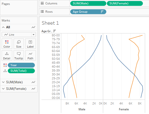
And if you want to create the small multiples you also add the dimension Year to the top shelf:
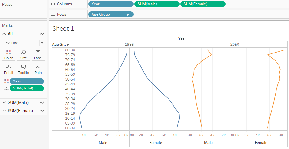
This doesn’t seem like much. What’s the problem of making two identical chart in Excel, right? Thing is, most of the time we don’t make two charts, we make dozens of them (US states, EU countries…). In Excel, you’ll have to manually assign the right series to each one of them. If you have 50 charts and missed a small detail, you have to change them all. What if you want to explore other dimensions? In Tableau it’s a matter of drag and drop a field, but in Excel you basically start from scratch.
Formatting
The way each tool manages chart formatting is of little interest, as far as I can see. Yes, there are differences, but they are to be expected. Much more important is the starting point and the amount of work ahead of you.
I like simple charts. This means that, when making charts, you have to spend time removing junk, reducing and changing useful objects like grid lines, and adding objects that can help reading the chart, like annotations. Remove, reduce, change and add: these are the four dimensions of my definition of simplicity.
Vendors should strive for simplicity when defining defaults. The other day we were discussing them on Twitter. That’s one of Xan’s responsibilities at JMP:
As a #dataviz vendor I’m always interested in recommendations for defaults. There are so many choices. Lately revisiting default axis scales (number of ticks, scale margins, …).— Xan Gregg (@xangregg) January 9, 2019
Most people don’t change defaults. That’s why they are so important. Unlike JMP or Tableau, Excel defaults emphasize glitter over simplicity and effectiveness. While recent versions are cleaner, Excel defaults still require too much work and time wasted on removing things that shouldn’t be there in the first place. Defaults in Tableau are not perfect, but there are fewer things to remove, reduce or change if you value simplicity and effectiveness over glitter.
I don thing Tableau goes too far from time to time and feels a bit nanny: taken literally, some options shouldn’t be used, but they can also be used creatively (in a good way).
Takeaways
While Tableau is a data visualization tool, Excel is a multi-purpose tool for all your numeric needs at the office. This distinction is often neglected, but it will define the whole chart-making experience. I wrote in my book that much of you need to learn about data visualization can be learned and practiced using Excel, but at some point you’ll out-grow it, and switch to a more specialized application.
Data visualization is a visual language. The way it is implemented in Tableau is far cleaner and consistent than in Excel. If you are a long-term Excel user, a few things will make you scratch your head, because it’s a completely different approach to data visualization. But they will soon make sense (except for the absence of error bars, that still puzzles me.)
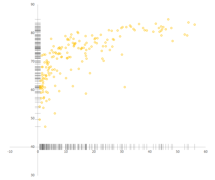
I couldn’t find a simple way of adding strip plots to both x and y axis in a Tableau scatter plot, something that you can easily do in Excel. Is this a natural limit of the Dual Axis model? Can it be circumvented? Hope someone from the Tableau community can tell me that no, this is not a limitation and yes, there is a workaround.
If I had to choose one of the tools to make a single chart I would probably choose Excel (“probably” means that I can’t control for skill level, so I can’t have a definitive answer now). I believe Excel offers much more flexibility and control over small details. For everything else I would choose Tableau.
In my previous post, I wrote about creating wordless instructions to make charts in Tableau, and one of the things I was not expecting was to feel that some charts, which are actually complex to make in Excel, takes you seconds to make in Tableau. I suspect these charts are here to seduce you: the real work will need complex calculated fields to overcome the limitations of the basic model.
When learning a new tool, you are not a tabula rasa where new knowledge will be engraved. You bring with you expectations, knowledge and routines from other tools. If you use these tools to solve similar problems, abstracting from the how-to and focusing on tool-independent tasks should reduce the learning curve. When making charts, selecting the data, translating the data into visual objects and defining their properties are common tasks that you’ll have to perform in Excel, Tableau or any other tool, so try to see what fits where.
Don’t reduce the differences between Excel and Tableau to functionalities, features or UX: They see the world from different perspectives, and you’ll have to understand them both. If you do, you’ll be happier.
If you liked this post, please consider sharing it using the buttons below. If you own my book, please spend a few minutes writing a review. And you could also check if my most recent project, Wordless Instructions, fits your needs.
Really: error bars? Do not exist in Tableau? maybe there is a way to implement them or maybe they are called with a diferent name (I very hope so) : )
Hi Carlos
Yes, no error bars, I couldn’t believe it myself. There are some workarounds like using Gantt bars, but that’s not the same thing.
Jorge