Here is the percentage of people at risk of poverty or social exclusion in the European Union and a few other countries:

We are going to resist the urge to identify them and use our preconceptions against them. Let’s dig deeper instead. Some groups are more exposed to the risk of poverty. Let’s see what happens when we split the data by sex:
How do you read this? For each sex, at the top you have the national average and at the bottom you have the group value. If the group has a lower risk, the line points to the left; otherwise, it points to the right. So, in this case the data shows very consistently that females have a higher risk of poverty or social exclusion than males.
Perhaps there are other factors. with higher variability. Let’s try age:
Lots of interesting stuff here: leaving your parents (16-24) is risky, while if you are 65 or over it can be heaven or it can be hell, depending on the country you live in. Let’s now add education:
As expected, there is a strong correlation between education level and risk of poverty. What about income and household type?
As you can see in the income, poor people run an extremely high risk of poverty (Monsieur de Lapalisse dixit). Explore the household type. Very interesting stuff too.
If you want to focus on the leaves only:
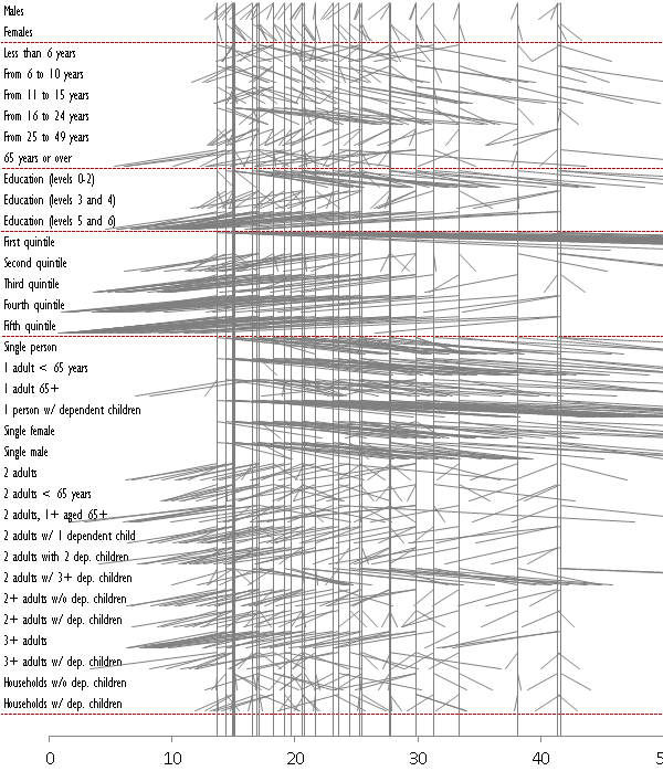
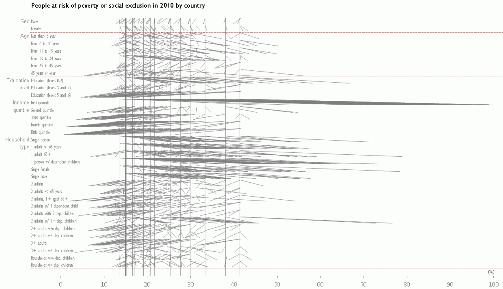
Here is the complete chart (click to enlarge):
Here is a comparison between two countries, Norway and Romania.
The bamboo chart: the bastard son of Mr. Slopegraph and Madame Parallel Coordinates. Do you like it? Do you find it useful? Confusing, perhaps? Do you know of a similar chart (link, please)?
How would you represent the same data? Here is the dataset (xls) for you to play.


It took about 5 minutes to digest this post, with most of that time spent sorting out the chart type I’d never seen.
The progression from simple to complex down the post works well. I would feel comfortable using this in a presentation or letting an analyst try to draw some conclusions from this report.
Found it very interesting to look at it like that, as it gives some indication of how the variables impact the results.
With any chart it hard to give a full picture, but the one thing that it lacks is the weight of the variable sub-divisions on the average vertical line. Chart tells you how variables fall compared to the average, but doesn’t give any indication of effect it has on the average (5 males that are way off the average will have little to no effect on the average if there are 999 females). In the case of 5 vs 999 the confidence level is going to be low as you might find a different results if 500 males and 500 females were compared.
There are a few things that I really like about this Bamboo chart, but at first I was having trouble reading it, so I remade it in Tableau and experimented a bit. The result is at http://public.tableausoftware.com/views/PercentatRisk/PercentatRisk-Selection with a tab for a version coloring each line by difference from total.
I am not sure I like the total line much, unless it is just for the selected one(s).
The biggest change for me was instead of having the total start at the top, was moving it to the bottom, so a down angle means less than the total, and an up direction means greater than the total. This change made the chart much more readable for me. The addition of color as an alternative could also support the reading of difference from total.
I really like how this chart shows the multiple levels of stories at the same time, and keeping context. Very well done, thank you for sharing.
Joe: I think that we can remove the total line to see the pattern in each row and add it to compare country profiles.
Thanks for implement the chart in Tableau. It gains a lot if we add interaction. Really nice job!
I think Joe turned the Bamboo chart into a Pine Tree Chart! Anyway, they looks really good. I like double encoding with color, I think it makes a real difference.
Anyhow … it took me quite a while to understand it but once I got it I started seeing complex patterns everywhere, which is a very good sign of course.
I especially like those factors where the results are mixed or where extreme outliers take place. Like Ireland, which seems to be the only country where being a single female in a households is not a problem. I also like to see the trend shifting from positive to negative (or the other way around) as the national risk percentage change.
One last thing … this is a clear example where a complex chart can gain really a lot from a little interaction. One thing I’d love to see is a filter to single out items with a specified difference.
This is an innovative chart type. I like it. I like Joe’s improvement on removing the vertical colour line when you focus on Norway and Russia. With the bold vertical line visible, I find I can’t stop my eyes concentrating on the vertical line rather than the slopes.
Great work!
Andy
Thanks Enrico. I also kept hunting for outliers (it seems that higher education in Romania really pays off; Iceland was the only country where being an active person in the 25-49 age group was riskier…)
Like parallel coordinates, you can extract some insights from a static version, but being able to interact with the chart is a much rewarding experience.
Thanks Andy. One of the images above excludes the vertical line because I wanted to show both versions. I think that it should be turned off by default to allow the user to focus on the patterns but once you start comparing profiles the vertical line creates some sense of unity.
I’m going to disagree with most of the comments here. Although I appreciate that Jorge is trying to come up wth something new, I find the graph cluttered and, importantly, I find it difficult to discern trends or a story. I can’t, for example, easily discern the patterns for any single country nor is it very easy to compare across countries within a single variable. This might be a minor point, but I also find it a little disorienting that the angled lines extend from the top of the row to the bottom of the row–perhaps more space between rows would help separate them?
If you want to argue this is best made as an interactive chart as Joe did in Tableau, I might be persuaded, but it doesn’t work for me as a static chart. Of course, in the interactive realm, there are lots of alternatives that allow the designer to pack lots of data into a chart.
As alternatives, what about a heat map where the cells would be measured as differences from the total? Or perhaps the cells could be measured as binary (0=below the total, 1=above the total)? I’ll post a couple of options on my Twitter feed. It may just be difficult to pack this much information in one chart.
Jon: Thanks for your comment. I’m not trying to “come up with something new”. I’m just trying to find the best way to display this type of dataset. That said, I would argue that a good chart type (in general, not necessarily this one) allows for at least two perspectives: local analysis / global analysis (the overall trends); interaction/no interaction. I believe that improving sorting and removing the vertical line can help revealing interesting patterns without interaction. Then you add interaction, and this allows you to compare country profiles, for example.
I’m writing a follow up post comparing this approach to more traditional ones. If you want to contribute with your own solution that would be great.
I think that, before a visualization strategy, we need a data strategy. We should try to find the right data and the right amount of data. But this is not a large dataset. We should be able to fully use it in a way that makes sense. It’s like a gym workout: if you don’t try to push your limits you’ll end up making pies 🙂
By the way: do you like parallel coordinates? Why?
I saw this today: http://www.tableausoftware.com/public/gallery/qualities-kids I thought it was a very poor chart in many ways. I downloaded the workbook, and took a look at the data (my favorite feature of Tableau Public). With a dot plot of each country, it was easy to see something was different about Hong Kong. Seems like they got a single choice survey and everyone else got a multi-select. I doubt the author could see that with his current chart style choice. I felt like trying to show this data in a Bamboo chart. Here is the result: http://public.tableausoftware.com/views/countryquality/ColoredBamboo
While playing, I found another alternative (as another tab).
Both highlight/filter based on your selections, so be sure to interact with them!
First is it very easy to see that something is different with Hong Kong, then once you know how to read the Bamboo chart, here is some easy to see insight:
– Across the board, Responsibility and Tolerance are valued, and Imagination has a low value
– Opinions on Hard Work, Independence, and Obedience are divided
– Selecting some of the top blue Independence lines, you can see that the countries that value Independence have a low value of Obedience, and vice-versa.
– Religious Faith has outlyers to the high value side.
– ctrl-Selecting both Responsibility and Imagination, you can see that Sweden values both those qualities the most.
The “Another Option” tab, does a nice job of showing the overall and the selection interaction lets you see the relative location. Less information is displayed, but I think some of the same messages can be communicated, seeing both detail and overall from multiple perspectives at the same time.
Oh, and I like parallel coordinates too! here is an example I remade a while ago in Tableau: http://public.tableausoftware.com/views/ParallelCoordinatesExample/ParallelCoordinatesExample