(click to enlarge)
I have a single and very simple resolution for 2013: make more charts. Simple charts, just to play with the data. Here is the first one. I like scatter plots with a time dimension, even though data points often look like drunken sperm.
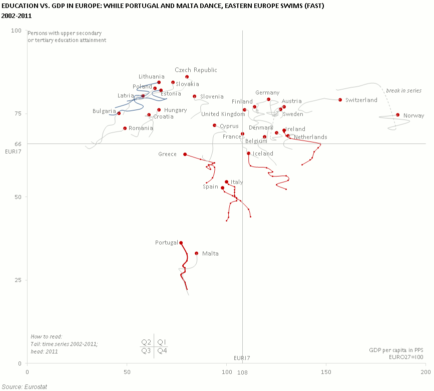
When you plot education and wealth in Europe, you always get a chart like this. Rich and educated countries in Q1, the educated but poor Eastern countries in Q2, and Club Med in Q3, with Portugal in a specially low position. You can see the impact of the economic crisis in several countries (I added markers to some of them to make it clearer), while the Eastern countries keep swimming towards a higher GDP per capita.
Ah, by the way, I decided to use a dotted line to denote a break in a series. We often forget these things.
So, how would you improve it?
This is very impressive. Took a bit of digesting, but not much really. After a brief explanation I realised how informative it is. Technically impressive, and the information value is great. Thank you.
Can you post the data?
Very informative – the markers work well to single out interesting elements.
A third dimension could be encoded into the heads/red dots by means of colour variation. E.g. geography (North/South/East/West), EU/Non-EU countries, type of government on a Left – Right scale. This may yield other interesting patterns.
Color legend for the trails! If I were expecting the image to stand alone and be interesting for a wide variety of audiences, I might also add a narrative description of what it means to be traveling at a particular angle, what the overall trends are. “Almost all countries increase in educational attainment over the time period, but those with red trails – those moving up and to the left over time – are doing so despite economic troubles.” If that’s really what’s happening, of course.
I love it! How do you add the time dimension? Are you doing it in excel?
Angela, I love data landscaping, but I must allocate some time for the storytelling part!
Yes, it is Excel. This is a simple scatterplot, where each country is represented by a time series. An extra series represents all the countries in 2011.
Jorge, I simply love your blog!
Ps. Can you point us to the source of your data? Thanks a million.
I can’t send you a link to a specific table, but you can find the data easily on the Eurostat website.