 I’m a consensus kind of guy, I can’t help it. I always try to find the best parts of not-so-good things (a Curate’s egg syndrome?). Let me give you an example.
One of the reasons why people like pie charts is because of its strong and familiar metaphor – it is part of our daily life.
Another good metaphor is the analog clock. You don’t need a legend to know the time. So, why don’t you use it to display hourly data?
Take a look at the radar chart on the left (the roman numerals – neat, hum?). It displays pageviews per hour by hour of the day. There are two series, daytime and nighttime. As you can see, the nighttime pageviews are much lower (I wonder why…).
If you want to compare daytime and nighttime data do everyone a favor: forget about day and night. Don’t assume that those 24 data points should be split in midnight to midday and midday to midnight. Or just because you raise early, the split should be 6:00 a.m. to 6:00 p.m. and 6:00 p.m. to 6 a.m. Look at the data and do what it tells you to do. A good split creates two series that maximizes variability between them (and each series becomes more internally consistent). In this case, the split was at 8:00 a.m/p.m.
Yes, but what about the Curate’s egg? Glad you asked.
Chandoo, over PointyHairedDilbert, had “an interesting charting idea to show the data around the clock“:
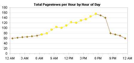
Jon Peltier doesn’t really like the idea and suggests a much more conservative aproach:
Now, shake both charts (shaken, not stirred…) and what do you get? My radar chart, of course! And what a fine mix of both it is!
Ok, where was I? Ah, yes, my soft boiled egg…


I have the same issue with your radar chart as I had with Chandoo’s double-trouble bubble chart. I don’t know where your series cross, unless I read the fine print and point with my fingers on the screen until I locate the 8AM-8PM crossover.
However, I’ve devised my own radar chart variation, and I’ve poste it to the bottom of my original follow-up to Chandoo.
I think a simple line chart will be more effective . the radar chart makes readers puzzled .
In telecom industry ,we usually draw a line chart with a 24h’s vol data, from 1-24 ,or from 7-6. readers can read it easily.
Jorge, that is very well done. You have managed to not break the metaphor while still bringing the key information out (more visits in day time than night)
I have suggested my readers to visit your post (as well as Jon’s) to see why my chart is Curate’s egg.
I will do a follow up myself later today or next Monday (my wife would kill me if I open the wordpress on weekend :D)
I consider Jon’s chart as the best one – I spent much more time to understand the radar chart and Chandoo’s chart compared to simple line. In fact the Chandoo’s bubbles are really difficult to understand (and even more if you would like to find some trends).
Anyway – it was a good exercise.
@Jorge: You should always challenge whether such split makes business sense. And in addition – you are right – the best split is where the variability is maximized.
@Jorge: What software are you using for that charts?
Josue: it is Excel 2007. I do everything in Excel 2003 and use Excel 2007 to export the image.
That’s like me, except for the 2007 part. Jorge, do you think he’s surprised it’s not a big fancy package?