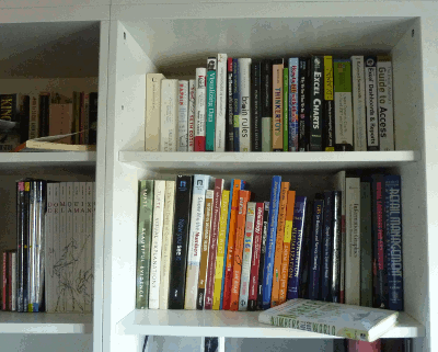
 Seven years ago, my wife and I drove 400 miles to the nearest Ikea store and bought furniture for the entire house. Today we have two stores in our city. Things change. Last week we bought a large, wall-to-wall bookcase and replaced some of the old stuff.
I don’t really mind to assemble Ikea furniture. Directions are simple and easy to follow (I like that when cooking, too). Actually, I advise you to buy something and assemble it before you start your next data visualization project. That will put you in the mood to fully appreciate things like:
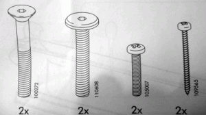
 Consistency. Ikea uses the same visuals, the same screws, the same bolts, over and over again. You may not know how to assemble a specific object, but you already know the underlying framework, so it’s easy to start working. Now, how many times we use a line chart just because we are tired of bar charts? How many times we use inconsistent color codes for the same item across multiple charts? Every time we forget consistency we are confusing our audience and wasting their time forcing them to adapt to our new rules.
Minimalism. Simple drawings that show you how to complete each step. There are no useless details, no fancy drawings, nothing. This obviously speaks for itself.
Show, don’t tell. Since these directions must work in a multilingual environment, text is avoided. If something mas be explained, it is explained visually. A chart is a visual tool, so the less text the better. Remove legends and label the series directly, perhaps using a picture/icon.
This is simple. After assembling furniture for a few hours you start recognizing patterns and you can avoid directions altogether. If you are willing to learn, you’ll learn fast. Inertia is a major problem when adopting even a simple set of data visualization principles and best practices. Apply them to a few charts and soon you’ll see why they make sense. And you’ll never come back to that 3D pie chart nonsense.
 Details as needed. From time to time, a more detailed approach is needed. We often try to put a large dataset in a single chart. The chart is then supposed to answer every single question the audience may have. This is obviously wrong. A chart is an answer to a specific question. When you are asking a question you are filtering the data, leaving out what you don’t need. If you want to show your market share, do you really need a chart with the smallest competitor? A new competitor is small but growing fast? Ok, show the details. But that’s a different question and may need to be addressed in a different chart.
So, keep it simple, tell your audience what they need to know, when they need it. Don’t make them think: use conventions (unless you do have to break them) and be consistent.
Oh, and I like Ikea meatballs too…
In case you’ve missed me…
I’ve been painting and renovating the house since early September. I never imagined it would take so long. Now I’m tired and just want to sleep in my bed again and have my broadband internet connection back.
I have two left hands with anything without a keyboard, so this is not exactly how I like to spend my time, but the kids are growing and I need a room for my new consulting business. But now I’m back and I’ll be posting more frequently.
This is a great observation. I hope the Ikea designers know that people are paying attention to how they did what they do.