You are a brilliant scientist and you just made an amazing discovery. You want to announce it to the world. So you prepare a few slides and decide to use that cute font, Comic Sans.
After the presentation you realize that, although people praise you for your discovery, a very vocal minority mocks you for using Comic Sans. After a quick search, you realize using this font was a mistake, blown out of proportion by a few idiots, focusing on stupid details because they don’t understand your scientific achievement. (I’m not implying this is an accurate description of CERN’s Higgs boson presentation.)
Over the last three days I was at a science conference in Lisbon, Portugal. There were several parallel sessions, so I can’t guarantee Comic Sans was not used. But it was there in spirit: bad pie charts, 3D bar charts, you name it.
I said where the conference took place to tempt you into believing these were third-rate scientists (they weren’t) in a peripheral country (OK, it is). My working hypothesis is that these scientists, the ones at CERN, and everyone else, do not significantly differ when it comes to communicating (visually) their science: they suck.
(Let me say that I’m generalizing here: not all scientists suck, and when they are good communicators it’s a pleasure to watch them, because they have amazing things to say. And let me point out that we can’t infer anything about the quality of their work just because they make bad slides.)
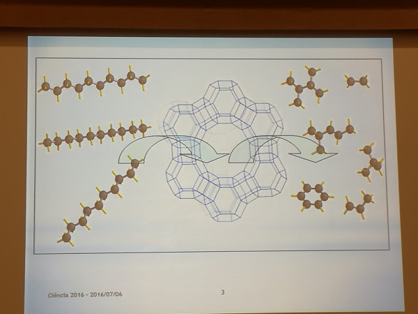
What makes them suck? Glad you ask. Well, apparently they have a “science mode” and the “comic mode” (from Comic Sans). When they switch to science mode, we get outputs directly from their work: no explanations, no annotations, often no title at all (or a very descriptive one). These charts are not there to be read, they are there to silently legitimize what the presenter is saying.
[fusion_builder_container hundred_percent=”yes” overflow=”visible”][fusion_builder_row][fusion_builder_column type=”1_1″ background_position=”left top” background_color=”” border_size=”” border_color=”” border_style=”solid” spacing=”yes” background_image=”” background_repeat=”no-repeat” padding=”” margin_top=”0px” margin_bottom=”0px” class=”” id=”” animation_type=”” animation_speed=”0.3″ animation_direction=”left” hide_on_mobile=”no” center_content=”no” min_height=”none”]
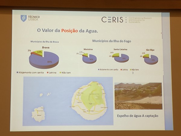
From time to time they switch to “comic mode”. They think people will understand better if they use a few colorful 3D charts. These charts come out of nowhere, they don’t really say much, descriptive titles again.
[/fusion_builder_column][fusion_builder_column type=”1_1″ background_position=”left top” background_color=”” border_size=”” border_color=”” border_style=”solid” spacing=”yes” background_image=”” background_repeat=”no-repeat” padding=”” margin_top=”0px” margin_bottom=”0px” class=”” id=”” animation_type=”” animation_speed=”0.3″ animation_direction=”left” hide_on_mobile=”no” center_content=”no” min_height=”none”]
They also have the “cram mode”, not as a third mode but as a background mode. Do they have a few interesting images? Cram them into a single slide and make them so small the audience can’t see them. A single image only? No worries: make it small and place it to the right of a long list of bullet points.
And tables. Too many tables.
Scientists, like everyone else, suffer from the curse of knowledge and fail to build bridges between their knowledge and audience’s. And often it is as simple as adding the right title or adding a note to explain how to read a visual. And they, like everyone else, often fail to recognize the rules they live by, when these rules are used in a different context.
No one wants to turn a scientist into a visualization expert or a graphic designer. When people notice that you are using Comic Sans or 3D pie charts it’s because you show you are not aware of basic practices, like basic table manners: don’t lick your fingers, use the knife and the fork. You don’t have to be an etiquette expert to know this, you just need to be aware these rules exist.
Now, I said we can’t infer anything about the quality of your research from your slides. That’s true. But please ask yourself if adding an animated clipart fish (true story) to your slide really improves your message.
So, what can you do? From a data visualization point of view, a few good books were published over the last ten years, some lite, some less so. You could read with my book, if you don’t mind the shameless plug. Nancy Duarte and Garr Raynolds are great references for presentations. I trust Jon Schwabish’s not-yet-released book Better Presentations: A Guide for Scholars, Researchers, and Wonks will also be an excellent reference.
You don’t really need to spend too much time to become aware of the basics and stop licking your fingers and prevent other from doing so. If possible, try to go beyond that, because it will reflect positively in your work and how people perceive it.
Here, take my napkin.
(Please note that I just use this etiquette analogy to make a point: basic visualization rules are simple, but not obvious. You’ll probably miss or will not be aware of them if you are not exposed to them on a regularly basis. Learn a few of them and then check your next graph’s compliance. Over time this things will become obvious, I promise.)
[/fusion_builder_column][/fusion_builder_row][/fusion_builder_container]