A single horizon chart is easy to make in Excel using overlapping columns or areas (the trick is to structure the data the right way). But the horizon chart is a variation of small multiples, so what makes sense is to stack them to compare multiple entities. That’s problematic in Excel.
But many charts can be done in Excel using a scatter plot, and making a passable version of a horizon chart is no exception. Can you figure it out? I have been trying to make a reasonably flexible chart without VBA and today I’m finally adding it as a bonus file to my Wordless Instructions packages (no wordless instructions for this chart yet).
The advantage of creating a horizon chart in a single chart instead of multiple charts is that you have much more control over sorting, synchronizing and making the design consistent. I do prefer making horizon charts with area charts instead of bar charts, but I’m not sure if that’s possible.
So, here are a few examples. Monthly employment rate by US state compared to the US rate:
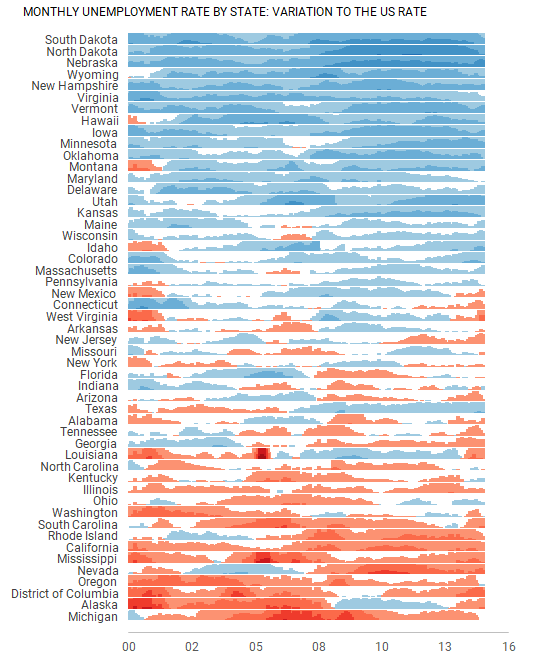
You can switch between names and codes to make more room for the chart.
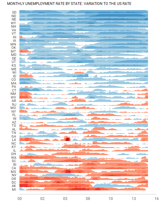
Horizon chart in Excel
It’s easy to switch between sorting keys:
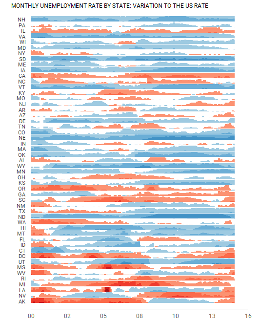
Horizon chart in Excel
Playing with bin width:
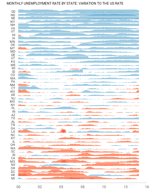
Horizon chart in Excel
I like the idea of mixing the horizon chart with the cycle plot. It’s possible to do it but needs more work and better data (maybe there is a hidden image in this stereogram):
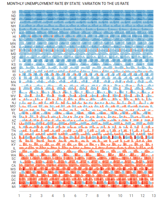
Horizon chart in Excel
No significant editing needed when pasting new data (it adapts to a different number of entities):
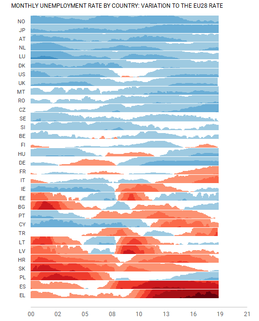
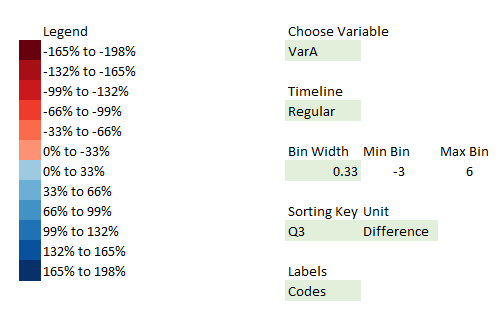
The current options and legend:
It gets slow with more data (with 500 months x 50 states x 12 classes it becomes really slow, but the computer I’m using is slow for everything Excel). Other than that, I’m very pleased with the results. Area charts are more pleasing to the eye, but I was able to show that some interactivity is possible, something you can’t do with multiple individual charts. And not having to use VBA is great.
This works with Excel 365 and probably Excel 2013 for Windows. I don’t think it works on a Mac.
I promised to add a few bonus files to the Wordless Instructions packages, and this is the first one. There are no wordless instructions for this chart yet, because I genuinely don’t know how detailed these instructions need to be. So, any feedback is welcome!
P.S. Last week, on my flight to the JMP Summit in Copenhagen I used the same table and could make the horizon chart in a few minutes. Haven’t tested it with Tableau yet, but I assume it should be as easy. Conclusions: how you structure your data matters; Excel is a pain when it comes to small multiples.
I should try it in PowerBI.
Kidding.