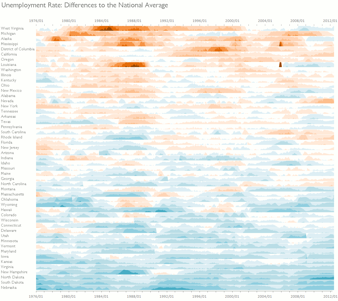
Here is the draft result of my little weekend project, making horizon graphs in Excel:
I’m probably using too many color bands, but I like it! The horizon graph is a very compact way to display lots of data points and a shiny example of how to break the rules for a good cause. It was developed by Hannes Reijner at Panopticon and Stephen Few discussed it in his newsletter and in a blog post. You can learn more about the horizon chart here and here.
Horizon graphs are even better if you use them as small multiples, as I did in the example above, and in the one below, from Panopticon:
There is something I don’t like about this one. If you look closely (click to enlarge), you’ll see that the charts are sorted alphabetically. This is a capital sin in data visualization. Much of the power of small multiples is lost when you do it, so don’t. You should think of a small multiples display as a reorderable matrix, sorting the categorical axis to identify meaningful groups. I’m sure Panopticon’s implementation allows you to at least perform a manual sort.
The Excel implementation
There isn’t much to say about it. A macro copies the data for each state to a new sheet and splits it into 12 series, one for each color band. Then it creates the charts and stack them together. You can record the macro and add a for/next loop.


Hi Jorge,
I love Horizon Chart, as it shows both the big picture and the details as the scale is actually several times the height of a single line.
It is also an excellent tool to detect patterns and correlations as series are vertically aligned.
not to steal your thunder, but Horizon Charts have been available in Excel for a couple of years in the charting add-in Sparklines for Excel : http://tinyurl.com/7aogz2f and http://tinyurl.com/chq2c45
Hi Jorge,
I wish we’d see more horizon charts – they are very powerful visualizations!
Are your charts sorted according to average difference from the national average?
Hi Fabrice. I was unaware of your add-in. Thanks for sharing. I’m always impressed with what serious Excel experts can do, and always willing to learn!
you’re right, sorting these alphabetically was a bad move. how did you sort yours?
bob: it was sorted alphabetically.
Hi Jorge,
i would like to commend you on your website here and what you do. i have learned a lot from you and Stephen Few. Now these horizon charts are interesting once you know what you are looking at. At first glance I had no idea until i read the explanation. If a chart has to be explained, is it good? I mean even a bad chart explained will eventually make sense. I am new at this and I kinda got the impression that a good visualization should be able to communicate clearly on its own, but perhaps I am wrong. I am kind of curious what your thoughts are.
Keep up the great work
Richard
Richard: “Precisamos de aprender o código antes de saber usá-lo”. I am communicating clearly, but chances are you don’t speak Portuguese so you can’t read the sentence. It says “we must learn the code before knowing how to use it”. Next time you see an horizon chart it will be much easier for you to read it. You don’t remember, but someone at some point in your life told you what a pie chart is and how to read it.
Now, if you do know what a line chart is and you don’t understand *my* line chart, that’s a different issue. You may have to learn more about line charts or about the data itself, or I may not be communicating clearly enough because I don’t know my audience and I should.
In this post I’m more interested about the chart itself and making it in Excel than about the data (that’s why the legend is missing, but it shouldn’t be…). Perhaps I should write a post about horizon charts, what they are used for and how to read them. Let me see.
Thanks Jorge,
You are right and i appreciate the response. Please write a post how to make one of these charts in Excel.
All the best to you.