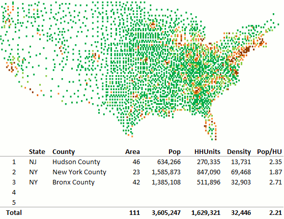
There are several objects in Excel you can make a map with. If you want to use shapes, you can follow my tutorial. You can also use a scatter plot. The map above uses cells and conditional formatting.
So, here is how to do it (this example used population data):
- Get a table from the US Census Bureau with latitude, longitude and population data by county.
- In a new sheet, calculate longitude intervals and use them as column headers (I’m using a 0.25 interval: lower means more resolution but more columns);
- Calculate latitude intervals and use them as row headers;
- With the SUMPRODUCT() function calculate total population, total area and density for each latitude and longitude class;
- Set column width to 5 or 6 pixels and do the same with row height;
- Select the entire table and add conditional formatting as you like;
Since you can’t add visible text to such small cells, you can merge them and add titles, legend, source, etc. A better option is to enter them in a separate sheet and use the camera tool to add an image to the map.
When you select a cell a small macro identifies the county and displays the data in the table below. At this resolution level, a cell usually contains a single county, but in densely populated areas there may be more than one county in a cell, as shown in the table (I’m also using the camera tool to display the table below the map).
I actually prefer to use a scatter plot but this is fun, and you can always ask your mother to cross stitch the map into your pillow!

Love this, Jorge, excellent solution
Thanks Andy.
What happened to step 4?! Like the technique though! Will give it a try with UK OS grid references.
Fixed. Thanks!
How do you calculate the long/latitude intervals to correspond to the line item long/latitude source data?
First, I created intervals/classes for longitude and latitude. The higher the number of classes the higher the resolution. Then I just assigned each lat/long pair to the classes. If the resolution is high enough then each class will contain a single county. A class is a cell in the worksheet, and you can use conditional formatting to make the thematic map.
This and other files will be available to the users of the dashboard tutorials (free of charge) as soon as I find the time to organize them.