It’s very simple, really: you do not compare proportions in a pie chart. Because a pie chart is not a comparison chart, it’s a part-to-whole chart. When you do this:
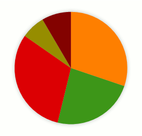
what you really want to do is to compare each slice to the whole, like this:

because, if you want to compare them you must do this:

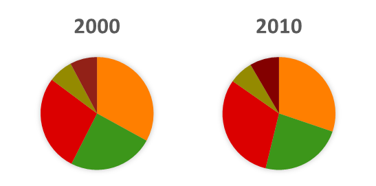
I hope that you find this pretty obvious. If you don’t, let’s add one more series.
When you do this:
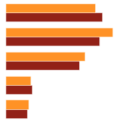
what you really want is to compare categories for each year, so you use a bar chart:
or, even better, a slope chart:
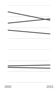
You never ever compare proportions, only a single proportion to the whole. The moment you change your question and want to compare data points you have to use a different chart. That’s why the optimal number of categories in a pie chart is one.
Capisci?
Good point, with which I agree. I had a nuance to make about comparing one category against a group of others and, since I needed the space and images, did it on my blog on my blog.
Actually, two. The one you’re interested in, and Other. Really thoughtful and well written post.
With respect I completely disagree with the conclusion, but the reasoning is correct and the example is extremely useful.
The fraction of interest is “most”, and the smallest combination of closely positioned factions or factors that sum to that fraction is most clearly portrayed in the pie.
The top horizontal bar chart shows how one faction compares to the others. It most easily shows how the biggest faction compares to the next biggest faction. It obscures, rather than reveals, how any pair of factions compare to the whole, (or to the magicial 50% + 1 unit) of the whole.
Red might ally to either Bright Green or Olive. An alliance with Olive does not give that coalition a majority. Alliance with Bright Green does.
Orange might ally with Bright Green or Brick Red. Again, the alliance with Bright Green results in that coalition’s majority. Alliance between Brange and Brick Red results in nothing at all worth the compromise.
Though Brick Red and Olive are both minority slices there is no point to either making alliance with the other. Even together, they can’t swing a coalition majority for either Red or Orange — though they do come closer with Orange that Red. Even if they compromise their intrinsic color and position they jointly approach the size of only one of any of the three larger factions.
The placement of the slices indicates (or should) that Orange and Red are always in opposition; unlikely to see members drift or shift from one set to the adjoining set. Bright Green and Olive are likewise diametrically opposed to each other. Brick Red set members might be lured into the Orange Set, as might member from Green. But members of Green are not completely opposed to the position of Red.
Orange and Red will each be politicing and wooing set Green, (giving Green some clout, if the adhesion or boundary enforecement of the set is strong) — or Orange and Red will attack Green, attempting to break it up, and peel off members of the set, if Green identificatioin is not strong or enforced. If Green is any sort of coalition, a stacked bar showing the composition of that membership would indicate to the Orange and Red leaders what sub-sets of the Green set might be peeled out, en masse.
The story told in the decade=to-decade comparison, as shown with side-by-side pies, shows that a Red-Green alliance in 2010 would for the first time (in the two sample history) result in a clear majority. The obvious dominance of an Orange-Green coalition has, in this story, weakened in the past decade.
The choice of charts depends on the story we’re trying to tell. Pies are a useful, though not the only, tool for telling a story about preference factions and fractions.
Jon: thanks Jon. You have to use two data points to make a pie chart, but if you go beyond the “making of”, you can actually hide the Other category. Perceptually it is easier to leave it but, like a real pie, you can figure out the whole without the slices you have already eaten…
Francis, as long as you only use one color and one shade of gray you don’t have to run for cover 🙂
Pouncer, are you sure you disagree? I can’t read that in your comment. You see, in a true alliance the two become one. You can represent both allies, but they must be unified under a single color (see Francis’ link for an example). In a pie chart, this means that you can group slices and use the group for a part-to-whole comparison. That’s not against the message in this post. It’s just a detailed slice. Even Stephen Few admits (reluctantly) that pie charts perform better than bar charts when comparing summed data points. I’m just setting the stage for that to happen.
This may be the best summary of the problems with pie charts, and what to do with them. Concise and simple, great job.
GREAT post, Jorge!
Finally an article that I think will help convince eradication of the pie. I shared it in a Linkedin group and was surprised by the very good and receptive response. Thanks.
Thank you Jorge for this great post, very easy to read and to understand. Thank you also Francis for the link to your blog which I really appreciated.
Excellent post!
To Pouncer’s points:
Very valid observation. If you are looking to see what parts of the whole combine to a desired effect, then the bar chart as displayed is not necessarily the best option. But I would argue that a pie chart also distorts the values, due to the narrow-to-wide orientation of the slices.
What about a stacked bar? Not necessarily for a series, but to replace a single pie chart. Set up clearly, I think this may better accomplish what you are suggesting.