How to create better charts? Search the web and you’ll find many specific advices, not always backed up by scientific evidence (can there be any?). Tufte’s advices are great for us, rational, positivist members of the human race, but what about those emotional poor fellows for whom a minimalistic chart is just a boring chart?
Can we remove personal aesthetics from the equation? Probably not, but we can minimize it. And if you have a set of basic principles that acts as a framework and guides you through the selection and design of charts you’ll end up getting a more efficient display than just relying on your preferences of the moment.
This six-part series focus on the generic design principles of simplicity, consistency, compatibility, congruence, relevance and conventionality (there will be a separate post for each one). These principles are defined by Michael Schiff in his master’s thesis, “Designing Graphic Presentations from First Principles” (you can get the PDF file here).
Let’s start with simplicity…

The simplicity principle states that a “simpler” chart will be easier to understand. By “simpler” it means fewer types of objects and properties used to encode information. This can be linked to Tufte’s minimalistic approach (the data/ink ratio, maximization of data density, no “chart junk”…) but extends beyond that, while having a more abstract nature.
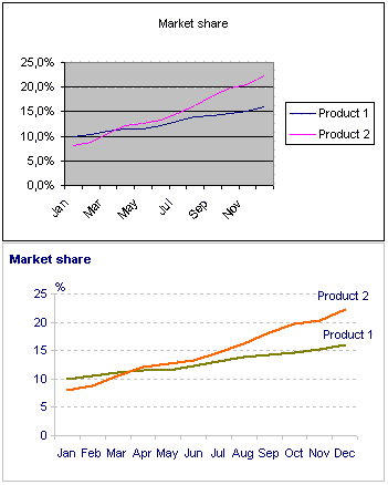
What happens when you apply this principle to the well known Excel chart defaults? You can see it on the left: after an extreme makeover you can really see the data on the second chart. There is a quote by Michelangelo that expresses quite well what happened: “I saw the angel in the marble and carved until I set him free.“
Note that each of the formatting options has a different nature:
- The gray background is pure chart junk and must be removed;
- The decimal place on the Y-axis gives us an irrelevant illusion of precision that doesn’t make sense; you can also remove the percent sign;
- The gridlines are supporting actors that you can leave muted in the background;
- Removing the legend and replacing it with direct labeling of each series has a deep impact on the user experience: there is no need for the movement of the eyes between the data and the legend and you can free up your working memory;
As you can see, the simplicity principle alone can improve dramatically your chart message. Please remember: a chart is not a product, a chart is a delivery boy.
Furthermore, you can use the method that many papers like the WSJ use for the months. J F M A M J J A S O N D. It’s very much common and folks should be able to figure it out pretty quickly.
What if your monthly data extends to two years or more? Can you still keep the line chart simple? This was the topic in my posting on April:
http://jpbi.blogspot.com/2007/04/monitoring-changes-over-time-my-best.html
Great article. I run a macro in Excel every time I build a chart that gets rid of the default format junk.
I like the look of moving the y-axis title and UOM to the top of the chart.
Two thoughts:
* Try Gill Sans for the font (per Tufte) – much easier on the eyes than the MS defaults
* Match the data label color to the dataset line color – easier to discern when the data intermingles.
If we discuss details. I would have reduced the number of horizontal lines to three, and just removed a vertical line. And most importantly, do not leave anonymous title. Each chart must convey the Idea. I would supply with a title here: “The growth rate of product 2 is higher and will take the quarter of market to the next February. “
Tony, grossu: Quoting Einstein, “everything should be made as simple as possible, but not simpler.” We must stop at a point where the marginal benefits are irrelevant or start to be negative. I don’t know if we can define where that point is. Do we know when we get there? Is it defined by growing perception costs? (Kosslyn believes that that happens in some of Tufte’s designs.)
Lee: I think Gill Sans is not available in a standard Windows installation, is it? If not, that can be a problem.
I guess I got lucky – our corporate Windows XP install comes with Gill Sans MT. I use it extensively as a result.
I’d love to hear thoughts on the appropriate font to use for data density in charts and overall readability.
I hear that Tahoma is a pretty popular choice. Also Calibri is pretty nice. By default I have Gill Sans MT in my Excel.
And, though it might not exactly fit this category of discussion, I would argue that the source of the data should always be present.
-tj
Tom, you are right. I have that in my miscellaneous tips in the 10×10 series. I confess that’s something I don’t always remember (usually my internal clients know where the data comes from).
Can you give a hint how you plot one label at each serie?
If I use Data Labels / Series Name, I get the series name at every data point. When you use a TextBox, it does not move with the line, if the data is updated.
Chris: just select a single data point, not the whole series.