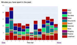
 I really dislike stacked bar charts… Let’s see a new bad example.
Steve Rubel shares with us how he spent his time online (update: page no longer available) over the last two weeks. He uses the Firefox add-on PageAddict to monitor the time. He writes:
As you can see almost all of my time online is work related. Still I can see that I need to shrink my social network usage a little bit and increase my time with documents, web applications while also keeping RSS contained. I also need to go through the undefined section to see if there are big groups of sites that can be tagged.
I would say that it is hard to see what Steve Rubel wants us to see. It is not his fault, of course, he is just pasting a chart from the application. I do see something interesting: since he spends “the vast majority of [fusion_builder_container hundred_percent=”yes” overflow=”visible”][fusion_builder_row][fusion_builder_column type=”1_1″ background_position=”left top” background_color=”” border_size=”” border_color=”” border_style=”solid” spacing=”yes” background_image=”” background_repeat=”no-repeat” padding=”” margin_top=”0px” margin_bottom=”0px” class=”” id=”” animation_type=”” animation_speed=”0.3″ animation_direction=”left” hide_on_mobile=”no” center_content=”no” min_height=”none”][his] computing time” using Firefox (let’s say 80%) he’s using his computer around 4.5 hours a day only. That’s nice… 🙂
If I wanted to visually track my time online (I should…) these are some of the options I’d like to have:
- Color-code work/non-work related categories;
- Label the x axis with dates, not “days ago”;
- Remove non-working days;
- Use small-multiples to track each category;
- Use weeks instead of days;
- Annotate outliers;
- Show planned vs. actual time spending;
- Minimize the “undefined” category;
I’m installing the add-on. Hope I can have an interesting dataset to share by the end of October.
Do you use these tools? Do you like their reporting functionalities?[/fusion_builder_column][/fusion_builder_row][/fusion_builder_container]
Totally agree, when I saw this chart I almost felt violated. This is a perfect example of very bad chart. For some reasons programs that promise to make managing things (money, time, whatever) have often poor graphics to present the data and thus making the whole thing unusable. The folks at google had it right.. have you seen the google reader trends, they dont use many color (actually they use just one) and present *only* data that is relevant.
Yet another case where simpler is better (i.e. more useful), both in the tracking and in the charting. A good rule of thumb in project management is “don’t track details finer than you’re prepared to actually manage and do something about.”
We use stacked bars, usually 100% stacked bars, but they typically have only 3 or maybe 4 segments. We use them to show student assessments broken down by category (e.g. “Proficient or Above”, “Almost Proficient” or “Far Below Proficient”), and usually show two years next to each other as a comparison. What we’ve recently done to make them more useful is to float them so the base of the “Proficient” segments in the two years match, making it easier to compare the trend of results above and below the cutoff. Sometimes there might be a number of sets of these bars, to break down subcategories of students for example. Even a whole row of these stacked bars is pretty clear, and probably would be even if we shrunk them down to “microcharts”. A quick scan immediately shows where there are “significant” differences from the other categories. Highlight lines could also be used, such as a proficiency target goal, running across the chart.
You might want to consider using a ‘ThemeRiver’/’StreamGraph’ instead – it can be easier for the eye to read along the timeline & see trends. Plus it can be prettier! Take a look at the following links:
http://infoviz.pnl.gov/pdf/themeriver99.pdf
http://www.nytimes.com/interactive/2008/02/23/movies/20080223_REVENUE_GRAPHIC.html
http://www.leebyron.com/what/lastfm/
Jorge –
Do you have a good alternative? The StreamGraphs that Joe cites do in fact look pretty, and they do help show totals, but I find it difficult to make sense of the individual items in the stream.
If you install the SQL Lite extension for firefox, you can access the “places” database which is where firefox stores your browsing history. If you want more control over your data and your charts, that’s a good place to start.
Tim, great tool, thanks. Let’s see what I can find (I am not sure if I want to know…).
Jon, Joe: some time ago I was playing with steamcharts (and, of course, how to create them in Excel…). They are visually interesting but they have the same problems that you’ll find in other stacked (area, line, bar) charts, plus they don’t have a base line.
To obtain the same effect that you see in the box office example you can’t have categories like “rss” or “search” or “documents”. Instead you should have projects A, B C and link specific feeds, searches and documents to each project. You may find that you spend 80% of your time in Google Reader, but is that relevant? Probably not.