Are you sure you can recognize an Excel chart from miles away? I thought that too. Then I started playing with some data visualization historical milestones and now I’m not so sure. Trying to recreate these charts in Excel is a great way to improve your Excel skills and pay a humble tribute to the data visualization founding fathers (their charts always look better).
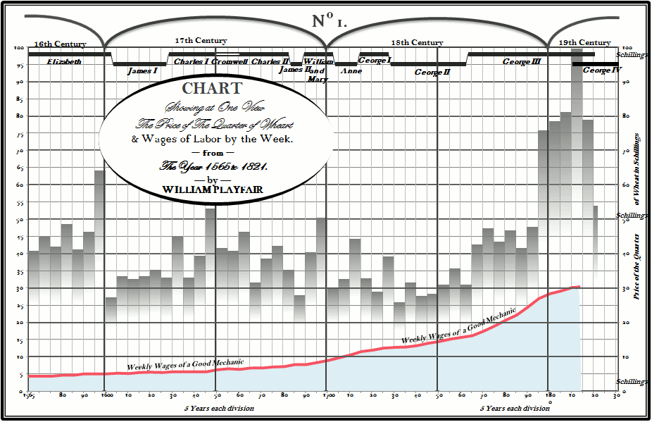
The challenge is to recreate the original chart without cheating: a single chart (no overlapping charts), no shapes/clipart to display data and, obviously, no Photoshop. Here is my rendition of Playfair’s prices of wheat and weekly wages:
(click to enlarge)
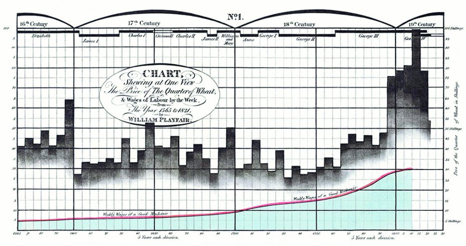
There are some details that I would like to improve (fonts, custom number formats) but it came out closer than I expected. Excel doesn’t like areas in front of columns, and that was the major challenge. If you want to compare to the original, here it is:
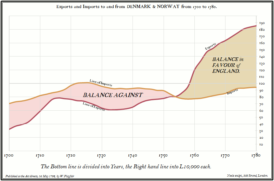
Playfair’s wheat prices chart was my second chart. I started with a simpler one, England exports:
And here is the original:
I’m not sure if I’m ready for Minard’s map of Napoleon’s March but I’ll try.
And the takeaway is: don’t make your Excel charts look like Excel charts (and don’t make your Excel dashboards look like Excel dashboards…). You have a fair amount of latitude to come up with a chart that reflects you, your style, your sense of beauty, your sense of how this data should be presented. Yes, it’s plain old Excel, but they don’t now it, do they?
Your comments?


Before you do Napoleon’s March, how about trying the London Tube Map..?
The two you’ve done so far look great – it looks like one of the strongest visual elements is the choice of font for axis and series/category labels.
I’m curious which ones you chose to work with.
Creating a chart quickly matters a lot for business users.
Truly excellent!
Really nicely done and what a beautiful tribute to some admirable classics!
It would be nice if the area charts didn’t obscure gridlines so much – good old William actually did that better without Excel.
Good luck with the Minard challenge – I am really looking forward to seeing that!
That’s also very challenging. And could be useful too…
Hi Jorge – Shades of the Sunday Brain Teaser from http://www.visualquest.in here. But a good idea.
By the way did you read up on the line graph on that blog.
I believe that Nicholas blog , Me, Myself and BI discusses one of William Playfair’s chart also while discussing line graphs. Maybe your readers would like to read up on that too.
I love this – really cool stuff Jorge. I might have a go at this myself at playtime!
Are you interested in sharing this spreadsheet? I am sure there is much to learn here!
David
Are you interested in sharing this spreadsheet? I am sure there is much to learn here!
David
Are you interested in sharing this spreadsheet? I am sure there is much to learn here!
David
Are you interested in sharing this spreadsheet? I am sure there is much to learn here!
David
I’m working on a few files (this one, the maps) that I’ll make available to my students as a Christmas gift.
I’m working on a few files (this one, the maps) that I’ll make available to my students as a Christmas gift.
I’m working on a few files (this one, the maps) that I’ll make available to my students as a Christmas gift.
Brilliant work Jorge!
Thanks Andy.
Great post and recreations! It would be great if you could share some comments on how you did it (perhaps a future post?). I do a lot with “brute force” excel, which usually means drawing on labels, lines, etc. I’m curious how you did the remakes without doing this – is everything really embedded in the charts directly?
Quality often suffers as a result of too much speed. Business charts must be well done – they are used to make decisions – sometimes big, important, even life saving/threatening decisions. The story that’s in the data must be effectively told and well told.
How did you do the fill in between the lines on the import/export? Actually, how did you do any of this? You don’t discuss your methods in the post or offer a sample . . . Can you provide some details?
Noah: this is an area chart with several series: a white fill that hides the bottom of the pink and the brown series. Then there is an invisible series at the top with vertical error bars (the vertical grid lines) and several series to mimic the horizontal grid lines. I plan to make available this and other files as soon as I find the time to organize them.
Awesome! Thanks so much for the response. I couldn’t understand how you accomplished the fill between the lines. I think I get it, now. I will play around with my own attempt. Thanks again and congratulations on an excellent site!
These charts are beautiful! Thank you so much for sharing them. I can’t believe they’re made with Excel.