Well, here is my first chart in Tableau, finally! After publishing my experiments with population pyramids (using Excel), I thought I could try Tableau Public with the same dataset from the US Census Bureau. Here is the result. I never really played before with Tableau Public and it took my less than an hour to upload the data and make this chart, without reading a manual or watching a tutorial (changing line colors was the hard part). It says a lot about its usability.
Population Pyramids 1981-2050
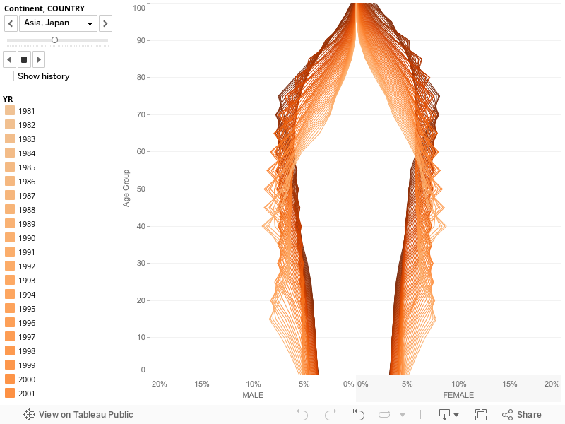
So, what do you think? There’s a lot to learn and your comments are much appreciated.
Cool to see your last examples in Tableau. Would love to see a video of the making. Interesting to hear that colors were the hard part. I’ve found color management way easier in Tableau than Excel.
I have a love hate relationship with Tableau. In Tableau some things are so easy and some things seem like they should be but I just can’t seem to get them to work. I don’t understand why so many charting options are grayed out so often. On the other hand I did find changing colors awesomely easy in Tableau. I made a head map of I/O response times and chose from cyclic color palette and bang it looked awesome, see here:
http://dboptimizer.com/2011/06/21/awr-mining-io-wait-histograms/
Kyle Hailey
dboptimizer.com
Kyle: The point is: I don’t want to learn Tableau, I just want to use it 🙂 Or, more seriously: is is possible for an average/advanced Excel user to start using Tableau based on tool-independent skills (data visualization, data management)? And apparently the answer is yes!
For example: reversing the axis for the male population data. That’s a great option. In Excel you have to calculate negative percentages.
For the pyramids in the previous post, I have a macro that adds all the 140 series to the scatterplot. You don’t need that in Tableau. And I have a second macro to change the color of each series. In Tableau you just need to choose the right palette (I was unable to find how to create my won palette, but I’m sure there is a way).
Very clever Jorge! I have to say that I found the excel charts interesting, but it took some work to get the message. I think this is a delightful and informative way to display pop charts, given the ability to highlight individual years. Less than an hour and no macro’s? You’ll have trouble going back. I still have to produce things in Excel (we don’t have Tableau Server at the office), but I find myself throwing it together first in tableau to investigate the data and design the presentation and then I spend hours or days trying to produce the same thing in Excel. As for color palettes in Tableau – you can’t really create a pallete in the same way that you can in Excel, but you can copy your view and create the next view with the chosen colors (it will retain the memory of color selections for dimensions), or you can copy formatting and apply it to the next view you create.
Keep up the great work – I love seeing what you’ll come up with next!
I love it! The technique of putting graded color on year is a very nice way to visualize data over time. I wonder if you could use area annotations show show male and female right in the view as opposed to on the axis.
Jorge,
Here is a tutorial for developing custom color palettes in Tableau:
http://www.tableausoftware.com/support/knowledge-base/creating-custom-color-palettes
MANY BLESSINGS!
Peace and All Good!
Michael W Cristiani
Another one bytes the dust … I was an Excel Junkie for years. Being within the web analytic’s field we historically didn’t have the large reporting tools … still don’t. Furthermore it is a much more marketing driven stats industry than mathematics.Fact being there is usually not a budget for SPSS or Cognos so Excel it was.
All that said I picked up Tableau a little more than a year ago … and never looked ack. In fact I had formed a side-company MashableMetrics where we designed and developed Excel Dashboards, and moved them all to Tableau. Tableau realized that the fault of BI had less to do with power ability and more to do with average users doing above average work – quicker.
I’ve been aware of your Excel work for years and I’m a fan. I’m also a Tableau data visualization consultant and have been working with the tool for nearly (4) years. This is a very creative display. Thank you for sharing this.
Thanks Dan.
These kinds of Blogs are somewhat deceiving. On the one hand, software like Tableau, Spotfire, etc, are are more about crunching large amounts of data for an individual to unearth trends than they are about Dashboarding; that part is secondary IMHO. And using the Population Pyramids as the pet tool to compare, is interesting and certainly consistent but in the long run, not very applicable to the reports most of us use.
Also, as a business user, I am looking for practical applications. All of these tools take a lot more effort to learn than indicated here – we are not all power users (and I have accessed the free trials of most.) And to be honest, the use of any of these would be in the simplicity to recreate dashboards – that is often their selling feature. But how to distribute? One would want to ‘publish’ into Powerpoint and/or HTML pages (for Intranets). And few of them do this simply, if at all. The only one I found that would is Xcelsius, which is not that great a dashboard product. By the time I have manipulated the data appropriately enough, I could just as easily use Excel to do mos to what I want.
Would be interested to hear how others use Excel or other tools to actually distribute their information.