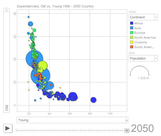
In my Demographic Dashboard I have a scatter plot that shows the trend towards an aging society. Today I wanted to test the new Google Chart API and the Motion Chart with the same data set.
The chart displays the old dependency ratio against young dependency ratio. It clearly shows the shift from high ratios of young dependency to high ratios of old dependency specially in Europe and other developed countries. This means tough times ahead (the adult population will not be able to pay for social security systems, expensive medical care, etc.).
If you click a specific country a persistent label will allow you to track its evolution.
If you want to play with the chart click on it to go to the published spreadsheet or follow this link. [fusion_builder_container hundred_percent=”yes” overflow=”visible”][fusion_builder_row][fusion_builder_column type=”1_1″ background_position=”left top” background_color=”” border_size=”” border_color=”” border_style=”solid” spacing=”yes” background_image=”” background_repeat=”no-repeat” padding=”” margin_top=”0px” margin_bottom=”0px” class=”” id=”” animation_type=”” animation_speed=”0.3″ animation_direction=”left” hide_on_mobile=”no” center_content=”no” min_height=”none”][Update: you could play with the chart directly in the post but I was getting some problems with Microsoft Explorer so I decided to remove it.]
If you are not familiar with the demographic concepts, this is what you need to know to understand the chart:
- Old dependency ratio: ratio between population 65+ years old / adult population (15-64 yeas old);
- Young dependency ratio: ratio between population 0-14 years old / adult population (15-64 yeas old);
- Total dependency ratio is the sum of the above two.
[/fusion_builder_column][/fusion_builder_row][/fusion_builder_container]

Hi Jorge,
The data is very well understandable. It makes myself playing again and again, watching individual countries moving, observing anomalies, checking country names, thinking about reasons behind anomalies (can I explain them), etc. Thanks for sharing.
Usability comment: I tried with Explorer 7 and Firefox. Firefox works. Explorer7 fails (displays only the frame of the chart, not the contents). I wonder what goes wrong…
When I tested the motion chart (), I used a different method on publishing. I chose Publish Gadget from the top-right menu of the gadget, etc. That works with Explorer7 too.
Regards,
-Janne
Yes, it is much better now. Thanks Janne!
[Well, I had to remove it…]