I’m an introvert, so it’s very easy for me to also be an uncompromising Marxist (the Groucho flavor), specially when it comes to club membership (I don’t care to belong to any club that will have me as a member) but things changed since I discovered data visualization. I love it and love this loose sense of community.
NTTS 2015
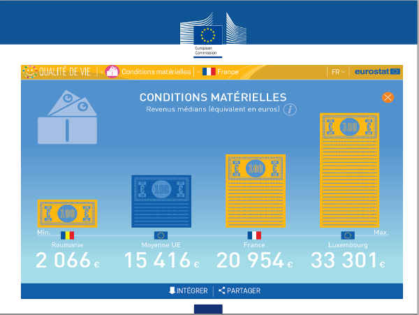
Thing is, this is a club with many rooms, some new, some old, some large, some small. There is a room I actually like, with many members, but people don’t look very proud of it, and it’s often empty. They apparently prefer lurking in other rooms. So I decided to explore these rooms too. The first one was full of tourists, hardcore statisticians. They (wisely) invited Alberto Cairo to show them around, which he did with the expected brilliance. You can watch Alberto’s talk here (jump to 1:49:45) and get the PDF here.
But I suspect they are uncomfortable there, and would prefer to crawl back to their caves, as soon as possible. They are able to create a complex statistical processes and then present the results using smileys and other silly visuals (strangely, Comic Sans is absent).
You can watch the presentation here (6:55:30) and get the PDF here.
They are changing. Several years ago, charts in the Eurostat publications were much worse than they are today. But I don’t think they understand what the right priorities are, and their blind allegiance to “insights” from focus groups is frightening. I left the room, feeling I could never belong there, because I am unable to learn hardcore statistics and they seem to be unwilling to learn proper data visualization (I’m over generalizing, I’m sorry).
Malofiej 23
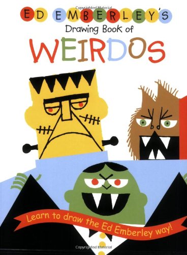
Last week, I explored one of the most successful rooms in the club, the infographic room. When they speak about “graphics straight into the vein” I think there isn’t much room for interpretation. There is real passion, and also talent and skills (visit Visualoop for for a good map of this room). For someone like me, it’s impossible not to love them at first sight. I was walking on air, but then someone uttered the wrong words: “we strive to balance function and beauty”. Bum! (that’s me, crashing to the floor). I recognize it’s their nature and it’s a noble goal that should be pursued by those talented people. I, mere mortal, am unable to match clothes or draw a strait line. Here is my advanced bibliography, when I try to draw:

I don’t envy beautiful illustrations, like the one who won a gold medal, by Fernando Batista for the National Geographic magazine. But I may become dangerous when some people make sketching seem so easy:
Adolfo Arranz’s work clearly proves that God is unfair. Take a look at some of his illustrations.
Unfortunately, some people stepped out of their comfort zone the wrong way, and I saw things I would prefer not to see. You should never force data into your preconceived visuals, even if you really think they are great. Data visualization is a tango between you and the data, just like illustration is a tango between you and the object. They will not let you do everything you’d like, but that comes with the territory. You must learn the constraints, test how far you can go, but you must always respect your partner. This proves a point I’ve being making for several years now: graphic designers’ artistic talent is their curse when it becomes to the visualization of quantitative data (when there is a data table behind the visuals). If they are able to overcome it and find the right balance between data and design they can be absolutely brilliant.
As for me, after visiting this room I’d like to put my infographic skills to test (maybe next year), but I don’t really belong here. I can’t cope with so much beauty, so if I want to do add something to the datavis community as a whole, the first thing I must do when I hear b-word is to block my ears with beeswax and tie myself to a mast. Now I just need to bring people to the room they belong to and explain its architecture, including my view of beauty as a welcome by-product, not a requirement, in this specific room. That’s one of the major ideas in my upcoming book (Yeah, I know, it’s starting to look like vaporware, but I’ll share a few unexpected developments soon).